INTRODUCTION
Emperor Airlines is an international airline that provides people the confidence to book flight tickets online. Emperor Airlines’ goal is to make booking a trip easy, engaging, and inspiring.
Target audience are people between the ages of 21 - 45 living in urban metropolitan areas.
*Please Note: This is a conceptual project completed as part of the Google UX Design Professional Certificate
Role
UX Designer
UX Researcher
Responsibilities
Competitive Audit
Conducting Interviews
Paper & Digital Wireframing
Low & High-Fidelity Prototyping
Conducting Usability Studies
Accounting for Accessability
Visual Brand Identity
Iterating on Designs
Project Duration
9 Weeks
THE PROBLEM
Booking flights is a stressful task because most available booking sites are cluttered with a lot of information, confusing layout, unclear navigation, and a long checkout process.
THE GOAL
Design a ticket flow for Emperor Airlines’ website to be user friendly by providing a simple and clean layout and offering an engaging checkout process.
UNDERSTANDING THE USER
USER RESEARCH
I conducted user interviews to determine specific challenges and pain points when booking flights, which I then turned into empathy maps to better understand the target user and their needs. I discovered that many target users feel overwhelmed and exhausted when booking flights because of cluttered information, confusing layout and having to go through a long checkout process. This caused users to feel unsure about booking a flight and feel like traveling is more of a tedious process than a trip of a lifetime.
PAIN POINT
LAYOUT
01
Airline websites are often cluttered with tons of text and information which makes it feel overwhelming
PAIN POINT
VISUALS
02
Heavy text and lack of strong visuals and photography makes it feel boring, stressful, and unmotivating to book a trip
PAIN POINT
CHECKOUT
03
Long loading pages and constant clicking to the next page makes it feel like a frustrating never ending process
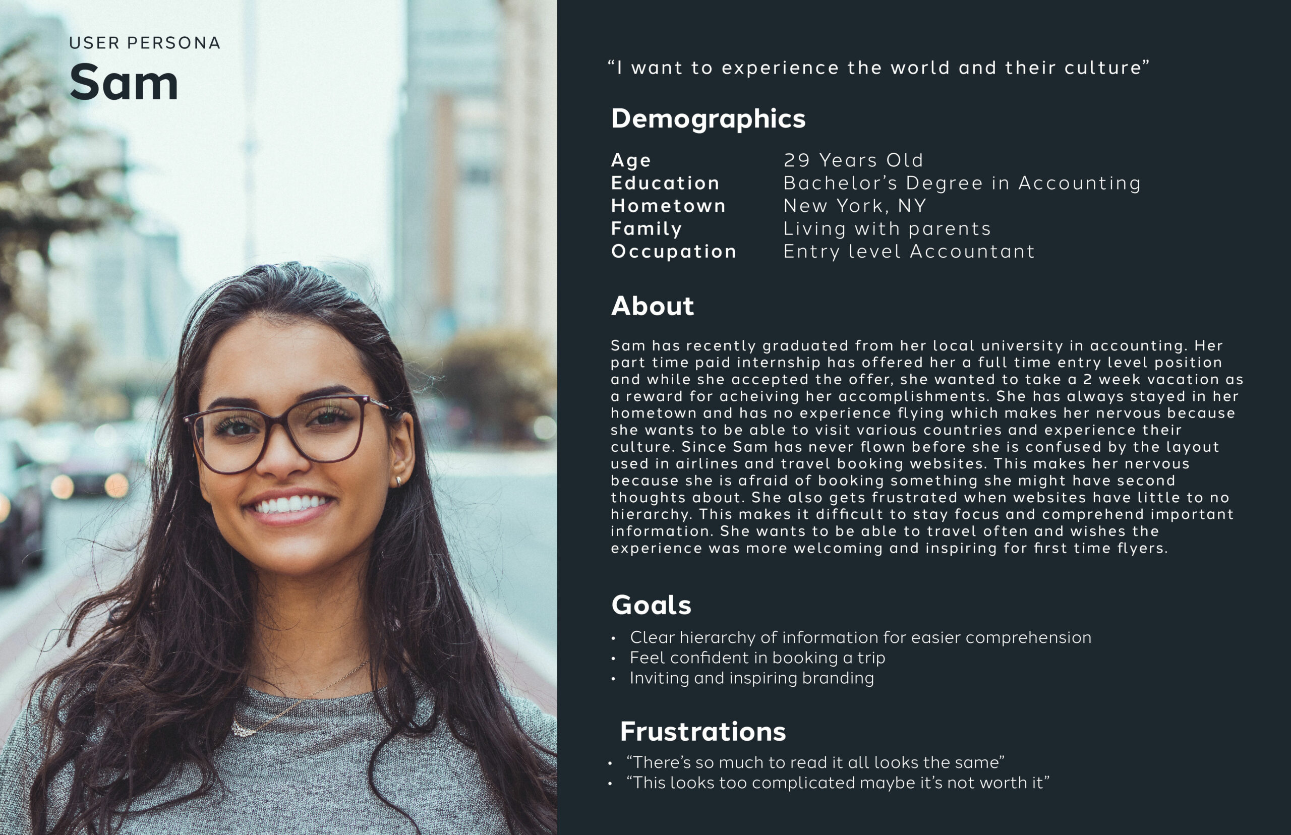
MEET SAM
Our user persona Sam was created after conducting interviews and gathering insights.
PROBLEM STATEMENT
Sam is a busy young professional who needs to confidently book flights because rewarding hard work is important in life.
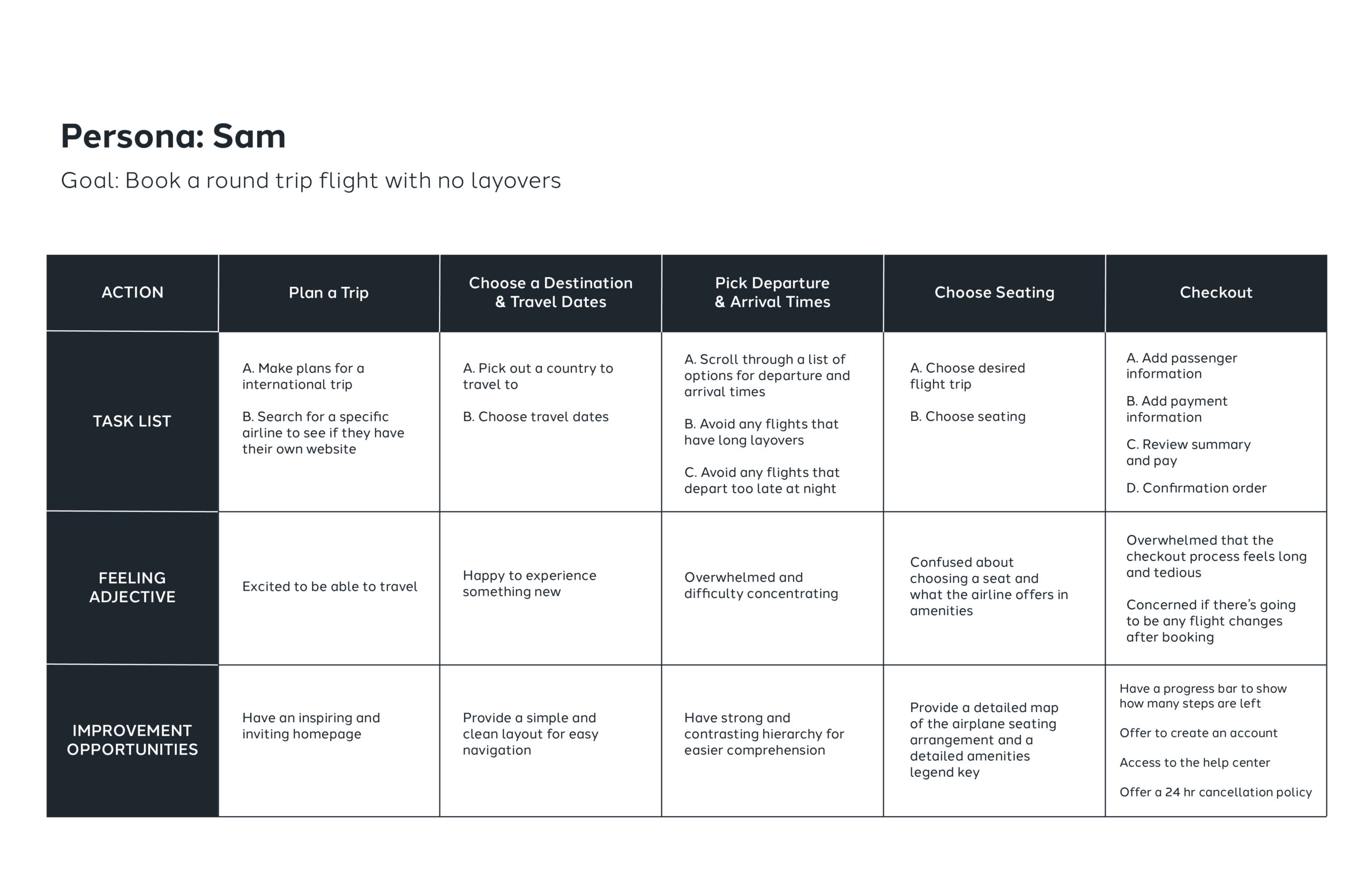
USER JOURNEY MAP
Sam’s user journey map is used to help identify areas for improvement opportunities. Key insights is that feelings turn negative during picking departure/arrival dates, selecting a seat, and checkout process.
THE PROCESS
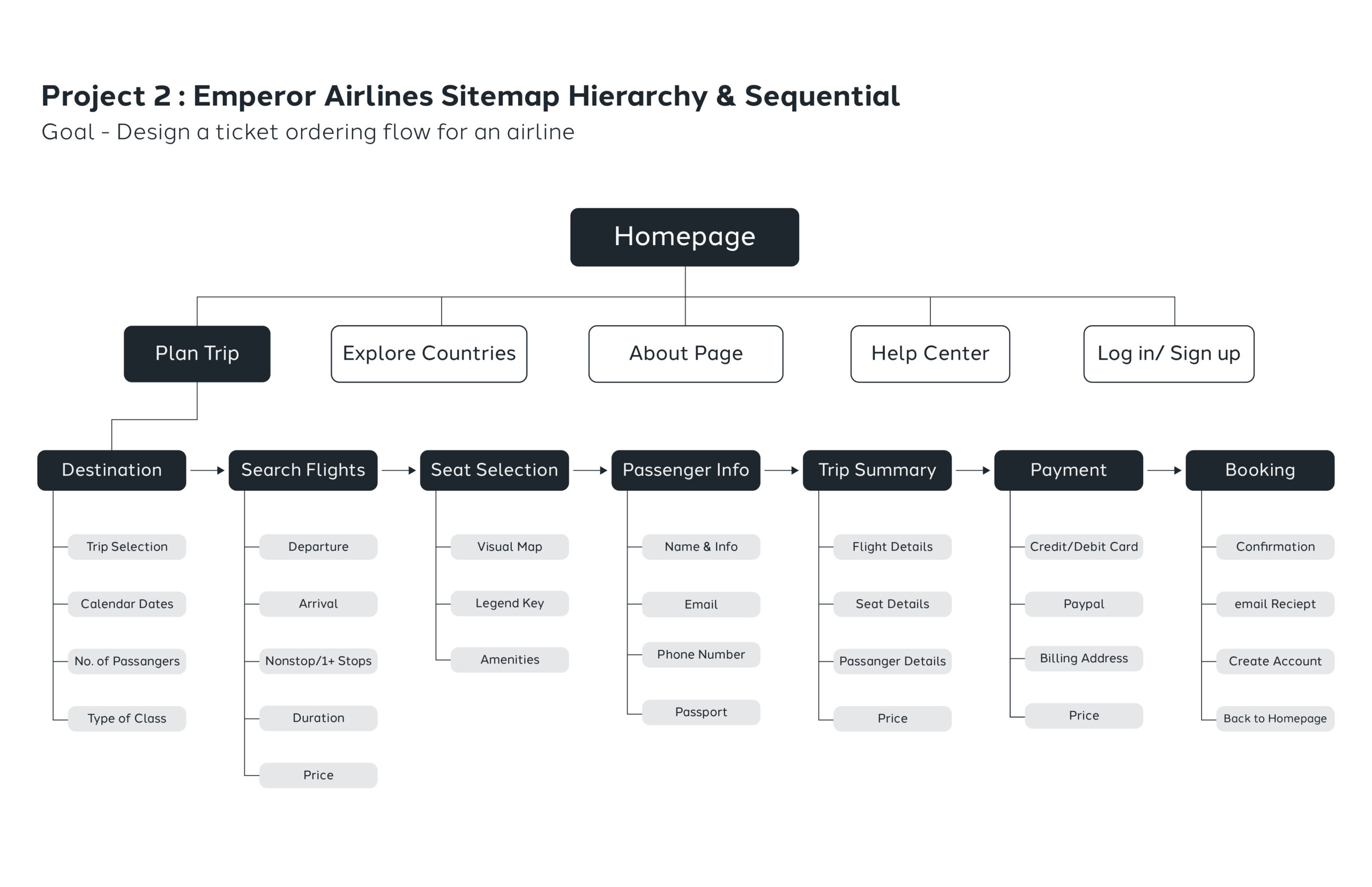
TICKET FLOW SITEMAP
The main goal was to create a ticket flow system that was simple and easy to navigate. I made sure the architecture structure contained key important features that prioritizes the user experience.
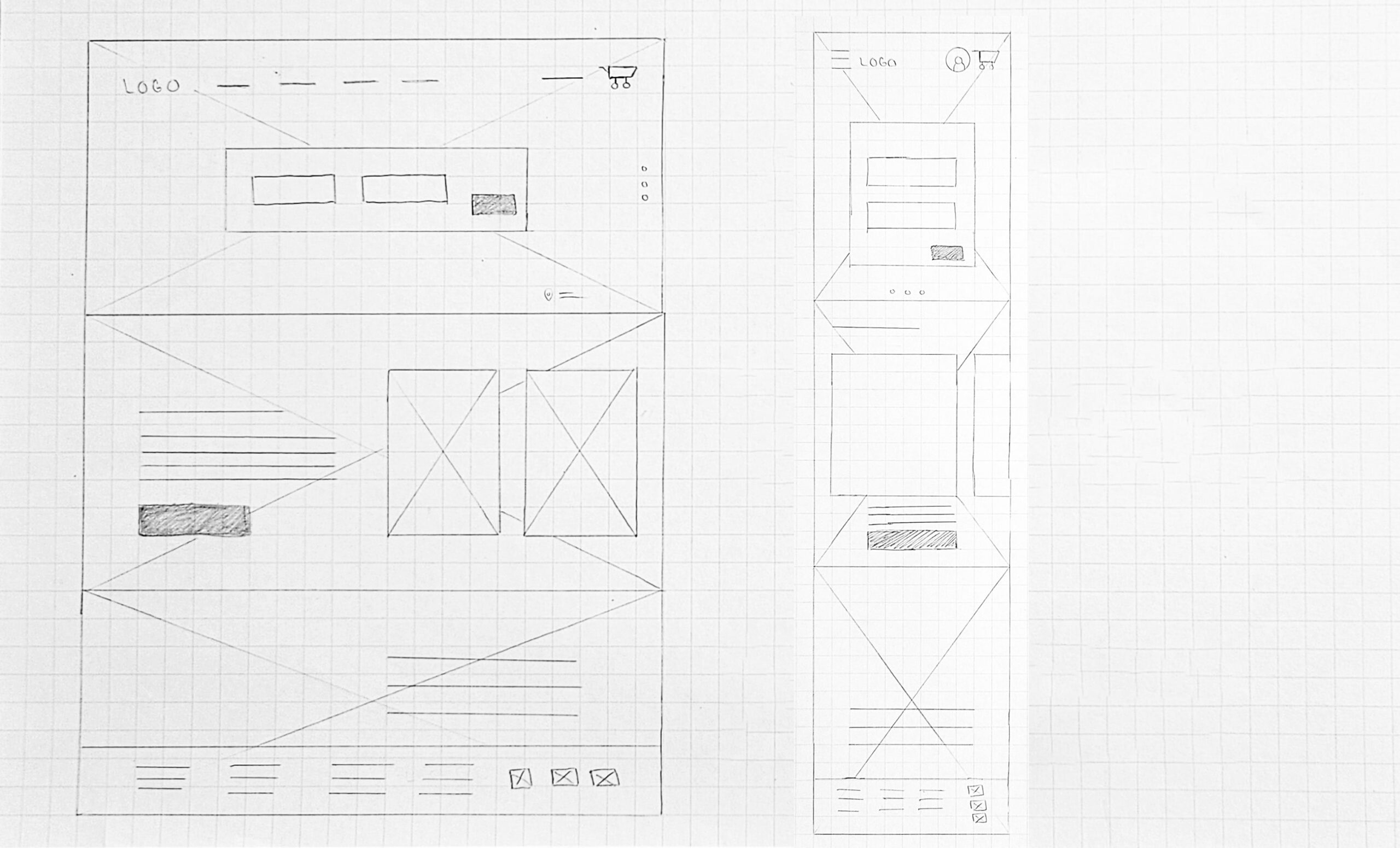
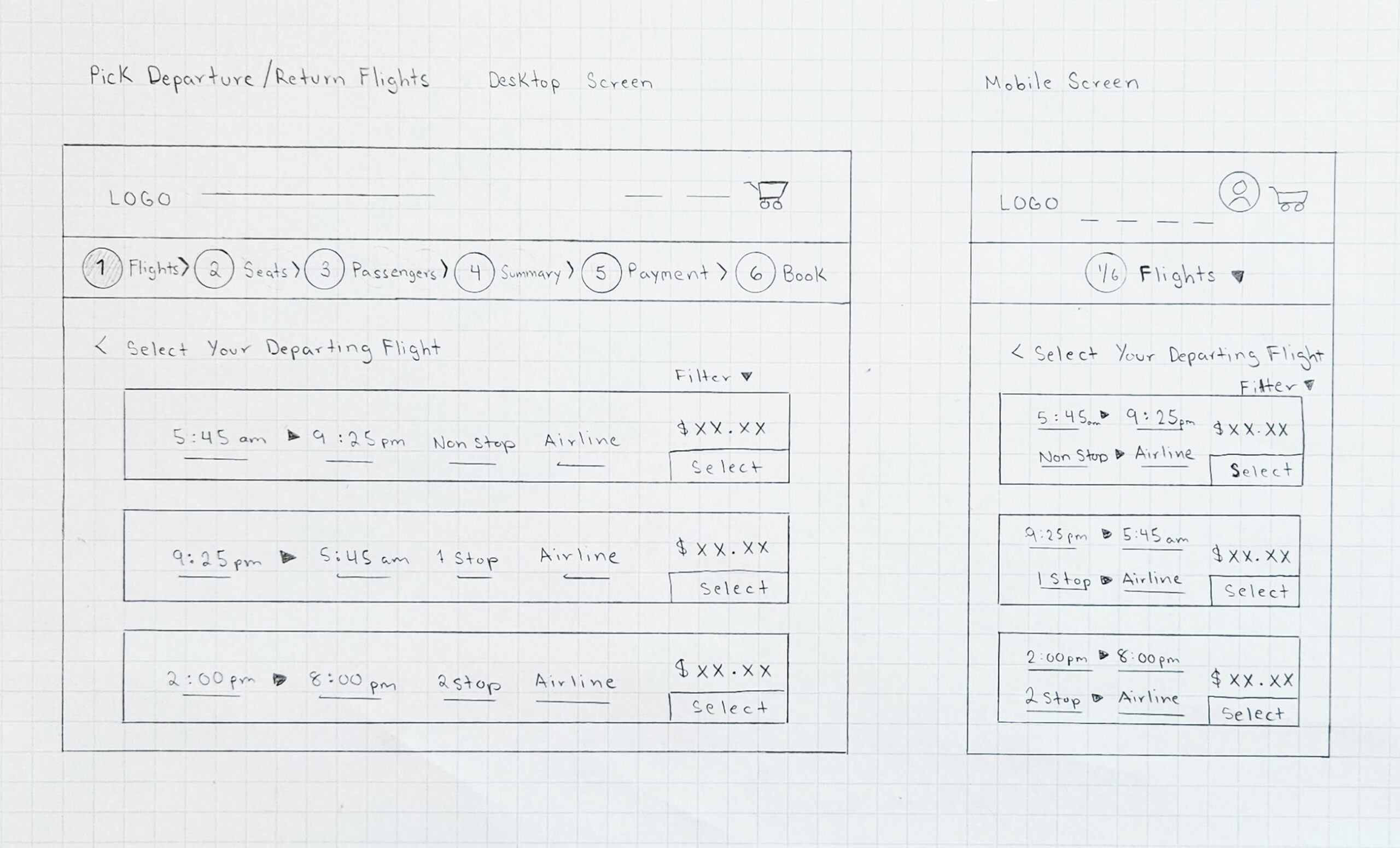
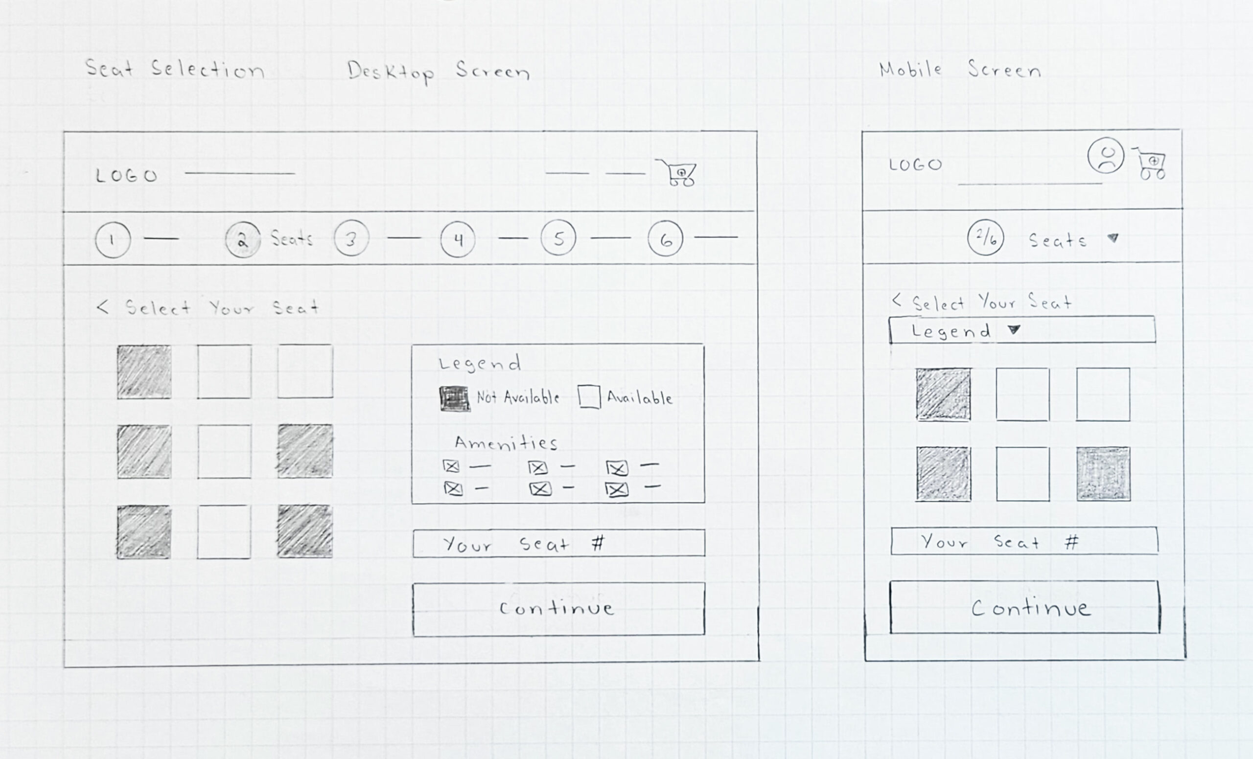
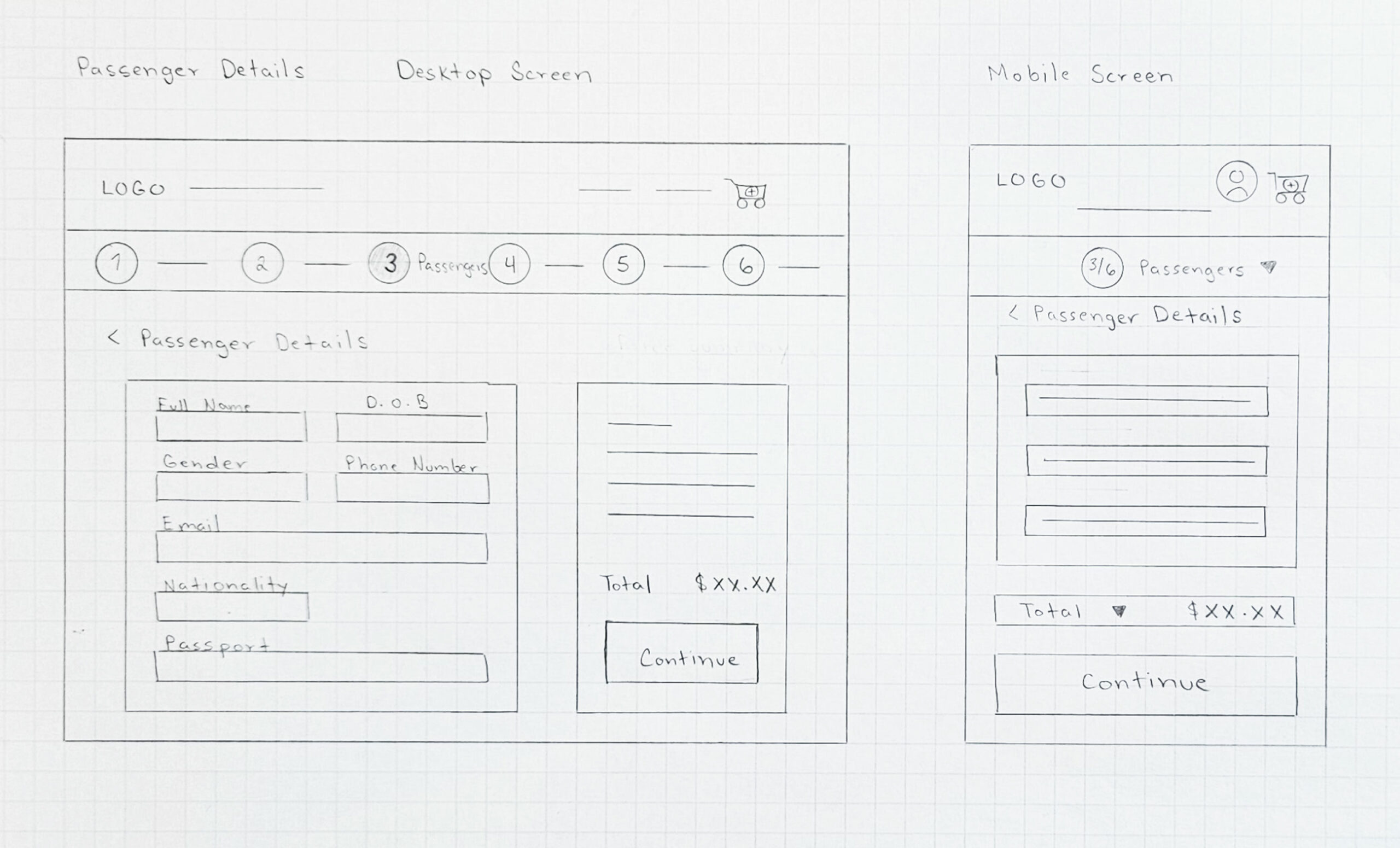
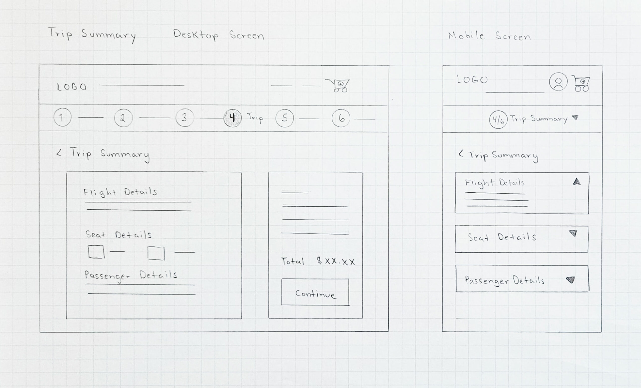
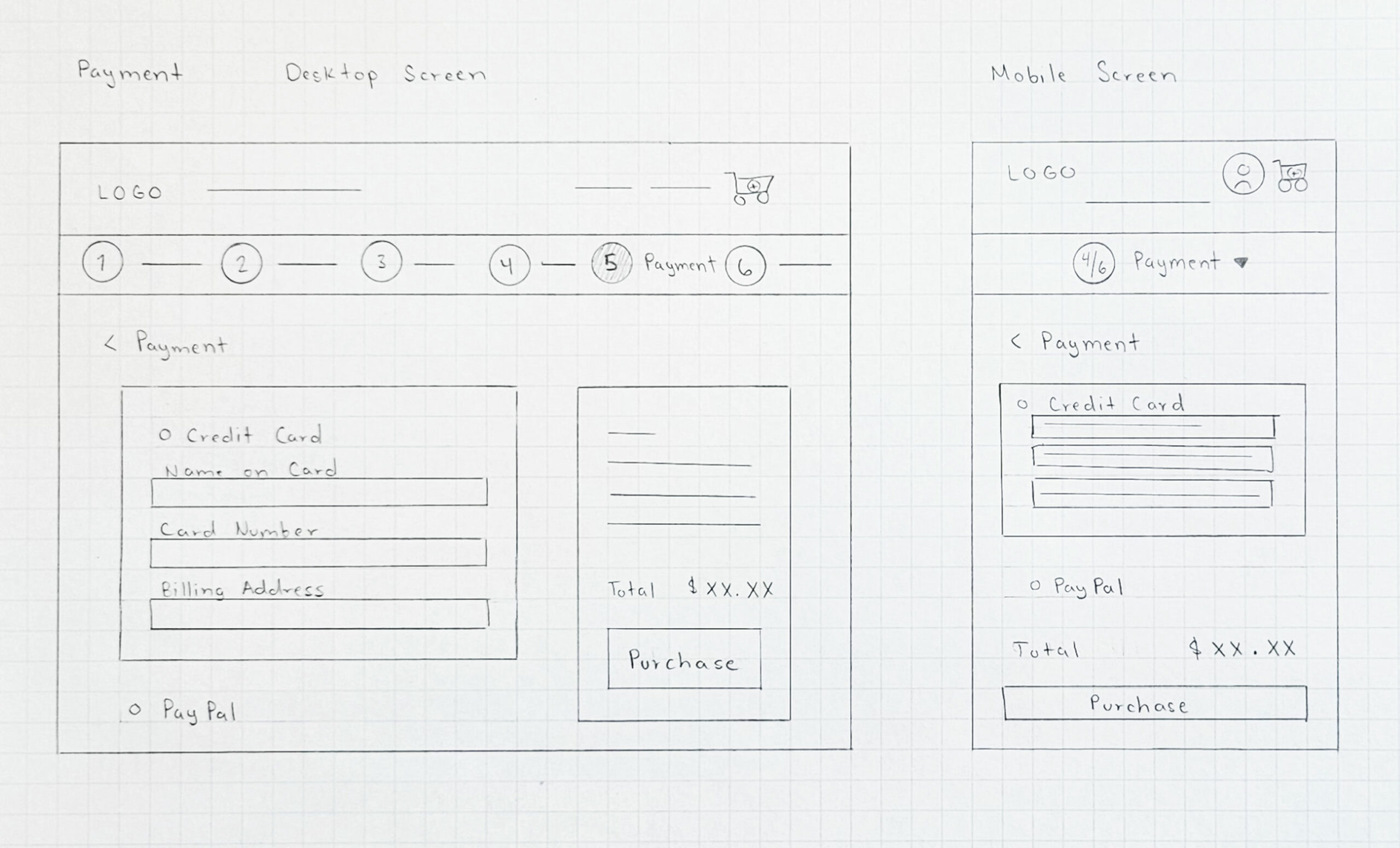
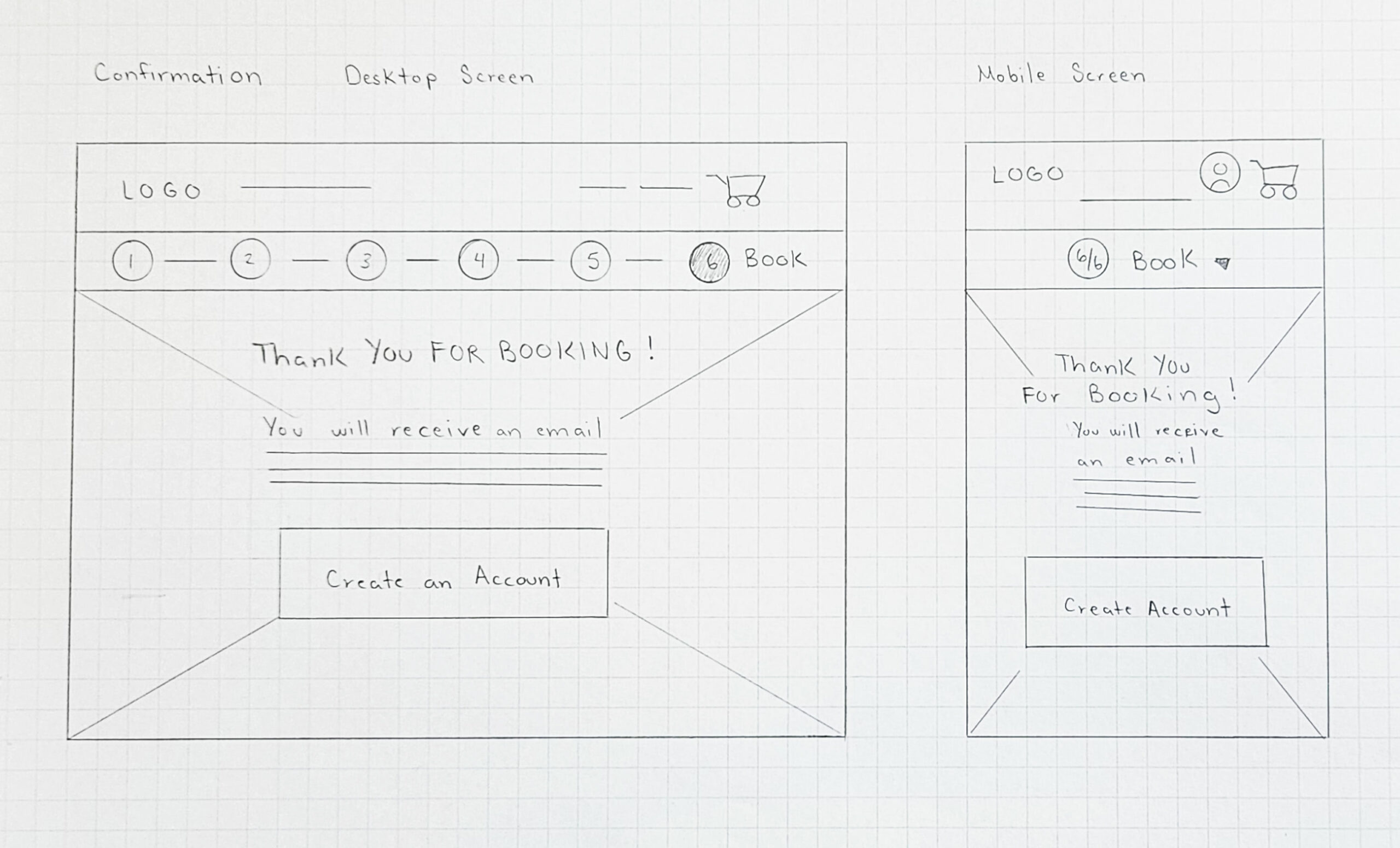
PAPER WIREFRAMES
After doing a competitive audit, I started ideating layouts for the homepage first because it is important to have an engaging landing page. This also helps brainstorm the direction of the branding of the airline.
I also worked on having mobile screen size sketches because many users access a website on mobile devices, thus I kept in mind how things will work in a responsive design.
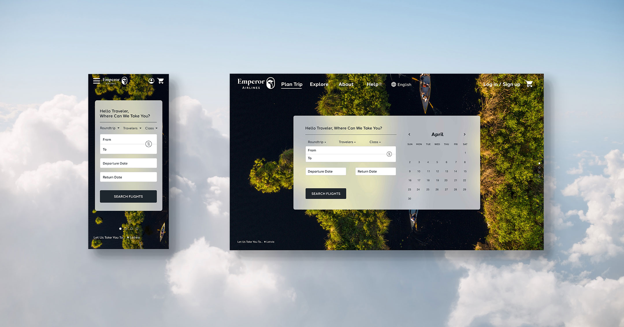
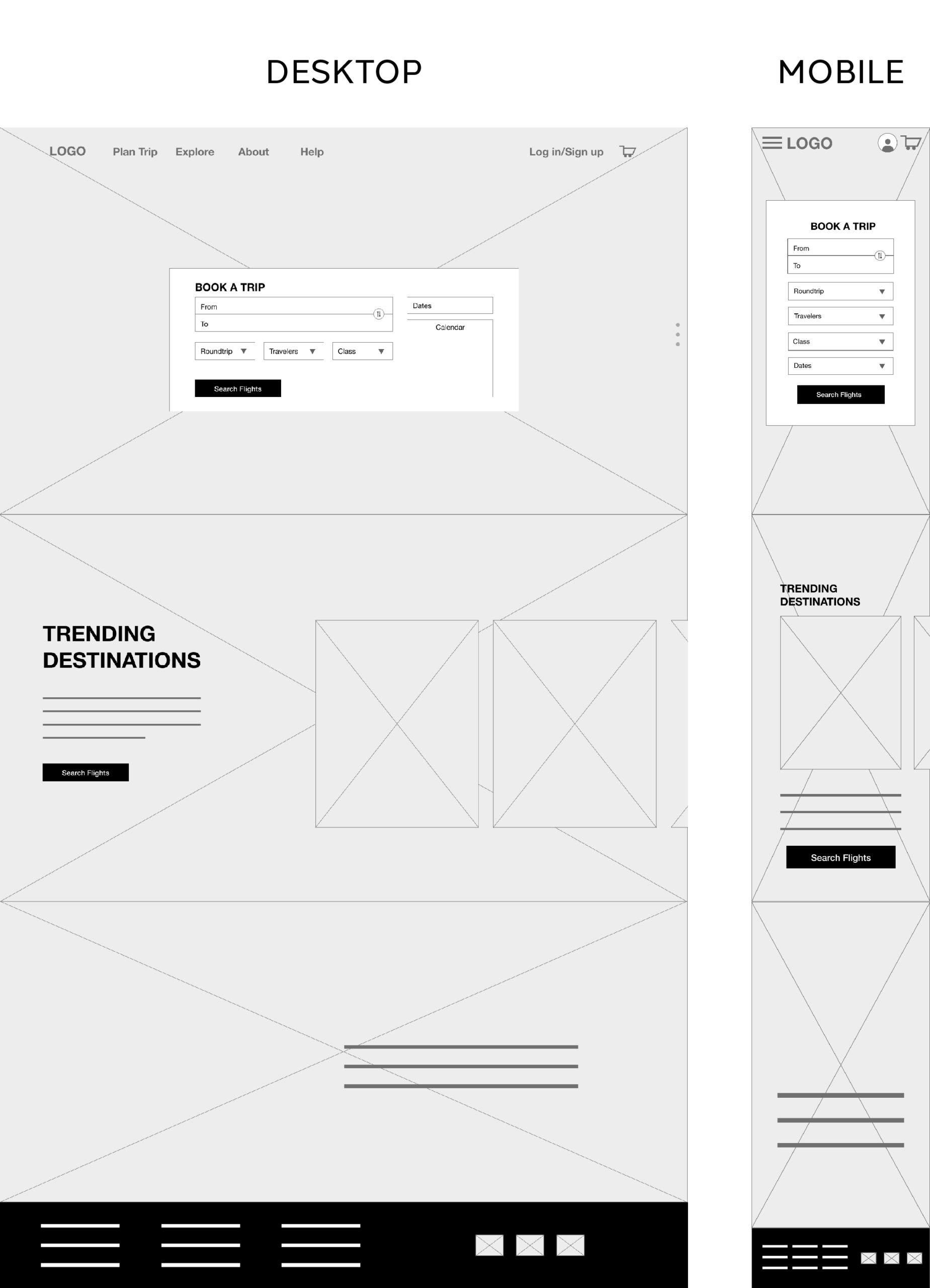
DIGITAL WIREFRAMES
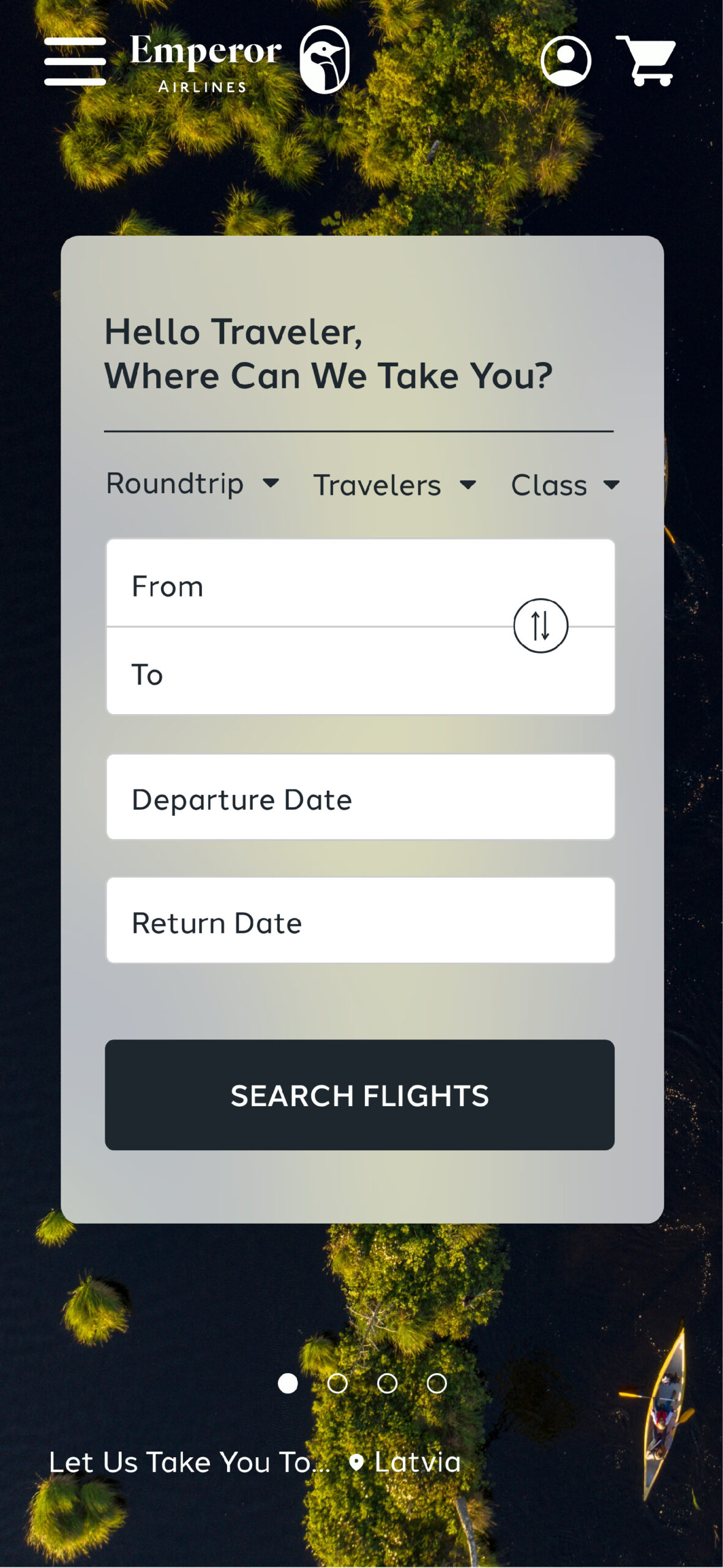
Prioritizing photography and a modern look was my goal.
- Booking fill out form is right in the center to get users to begin booking their trip
- Cover size photographic background will help users feel engaged
- Trending Destinations for trip inspiration
MOBILE SCREEN SIZE VARIATION
I made sure adjusting to a smaller screen size kept consistent with the desktop layout. I rearranged elements appropriately and optimized the limited space available.
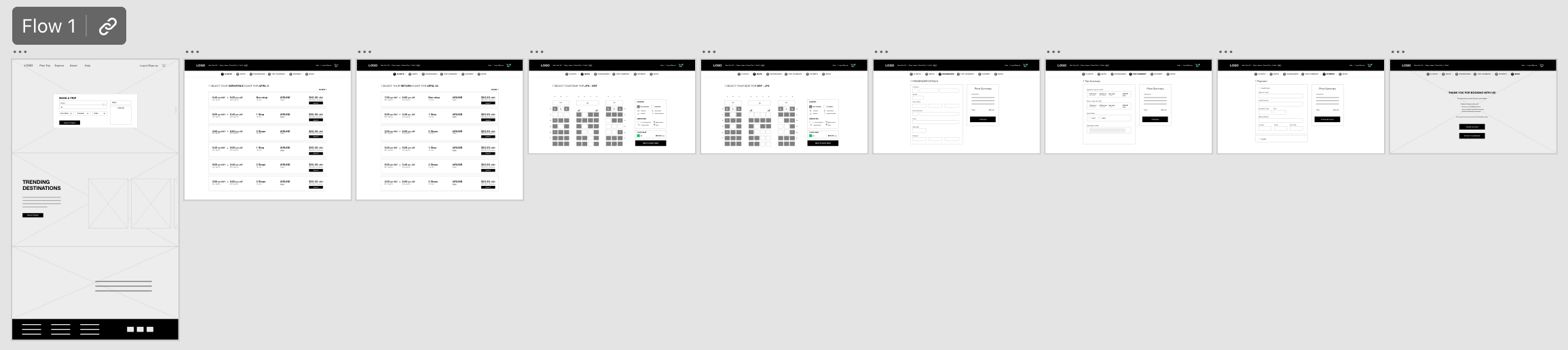
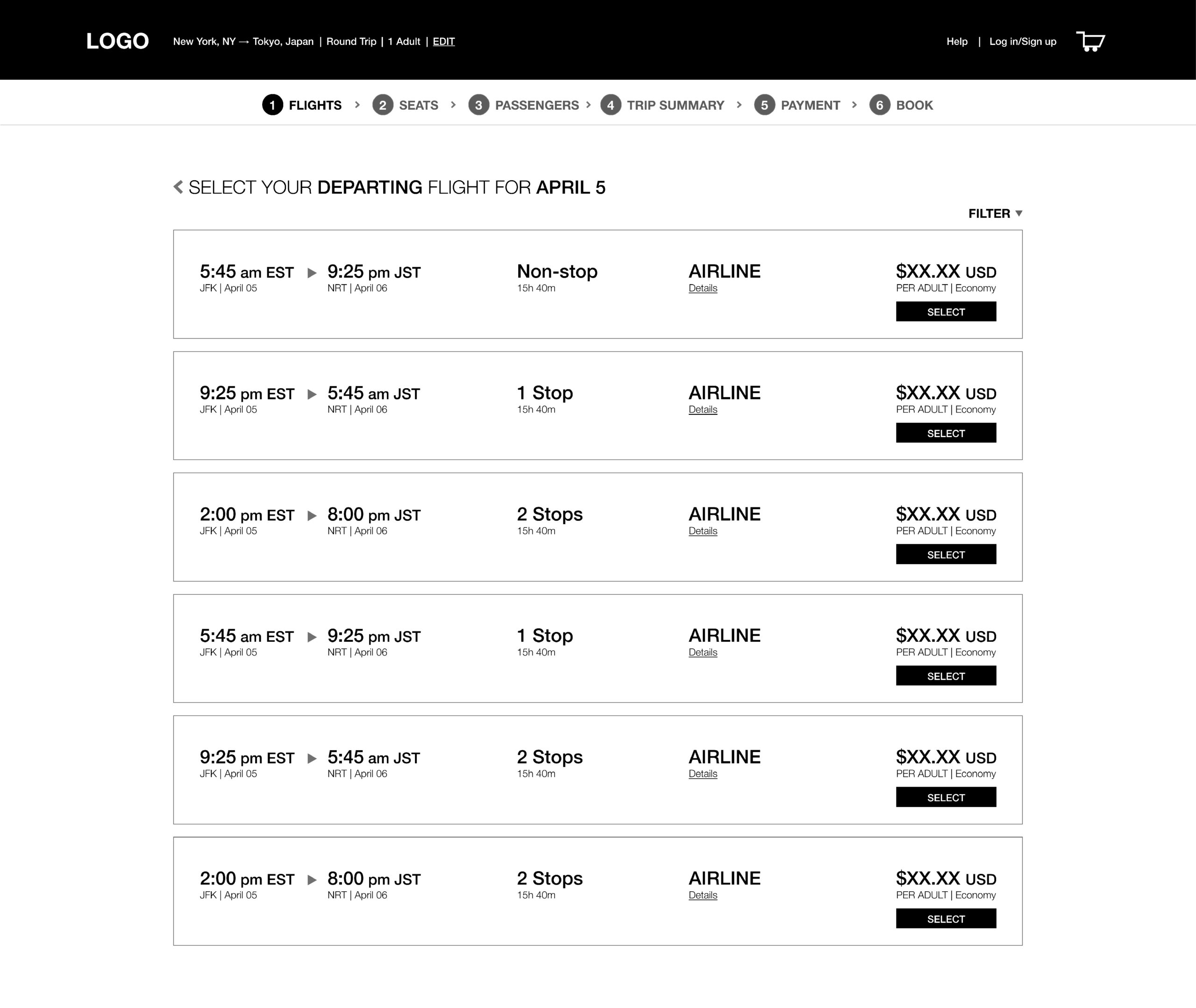
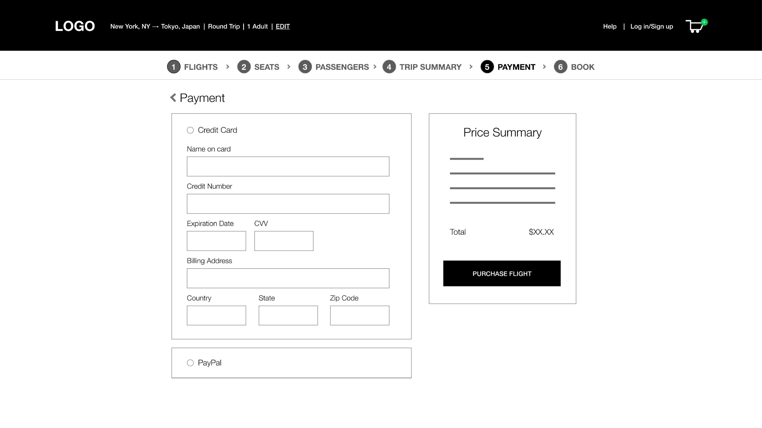
LOW - FIDELITY PROTOTYPE
Main user flow for the low fidelity prototype is to select a flight, select seats, input passenger info, input payment info, and complete booking.
View Emperor Airlines' low-fidelity prototype here.
USER TESTING
USABILITY STUDY: FINDINGS
I conducted a usability study to find out if the main user experience, selecting and booking a flight, is easy for users to complete. I also would like to understand the specific challenges that users might face in the ticket flow process.
After conducting a usability study I gathered all information to create an affinity map. Next I analyzed and synthesized results to find insights.
INSIGHT
ADD ICONS
01
Users found hierarchy to be good but not enough visuals like icons are used
INSIGHT
PROGRESS BAR
02
Users found progress bar difficult to see progressing. Colors blended together making it feel unnoticeable
INSIGHT
DESTINATIONS
03
Users were confused about the trending destinations section of the homepage.
REFINING THE DESIGN
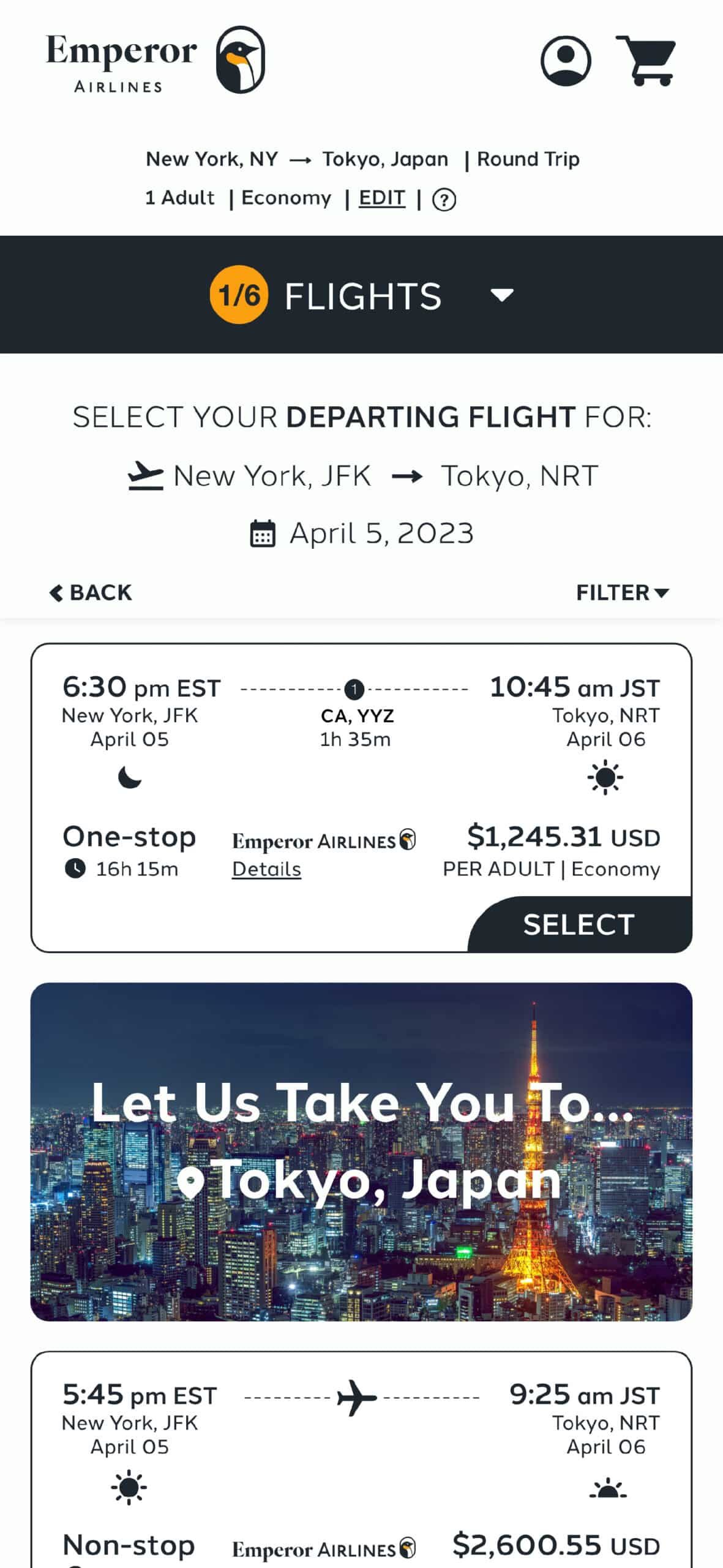
SOLVING INSIGHT 01
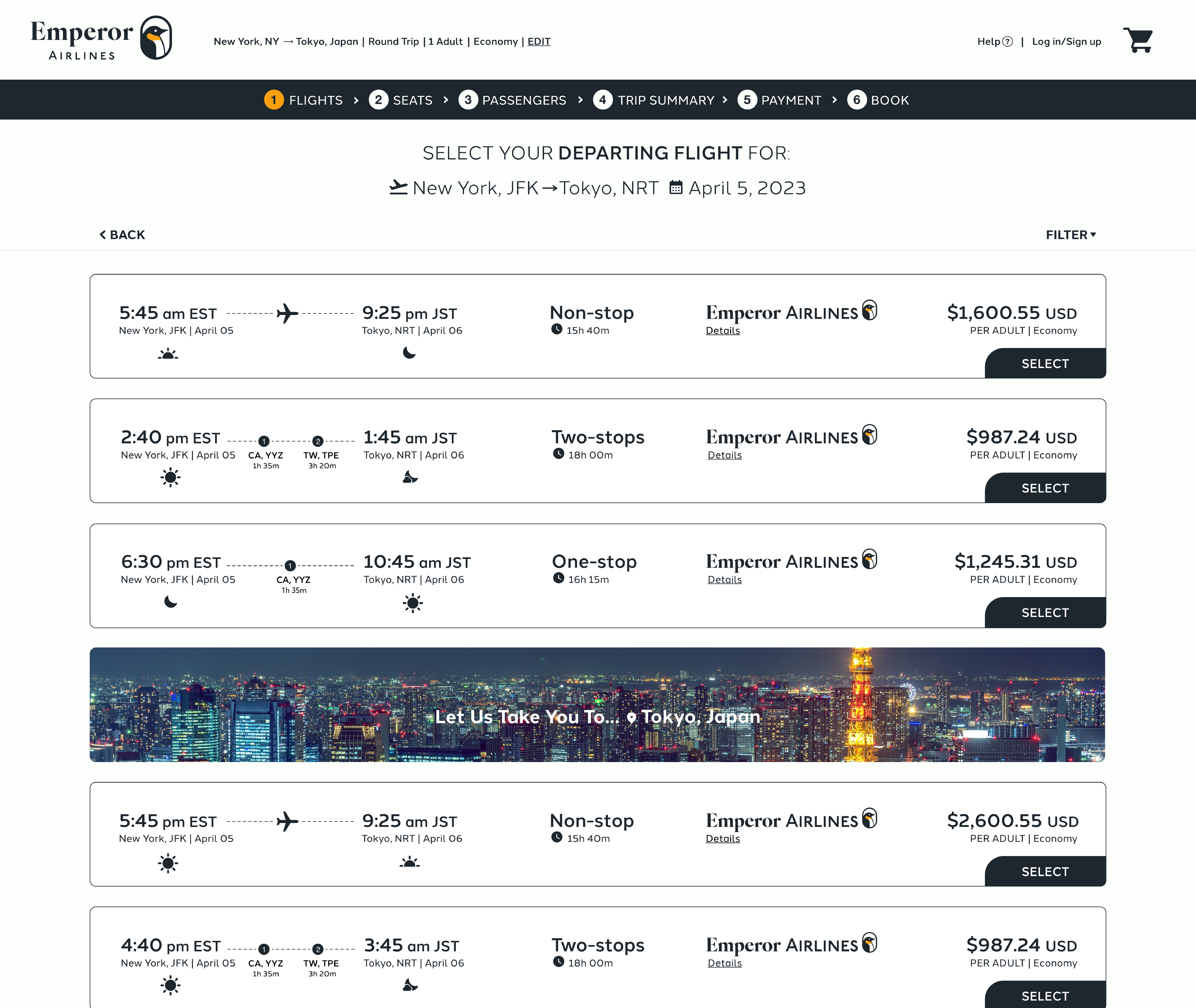
Visual cues such as icons to indicate the time of day, non-stop, one-stop, and two-stops flights, icons for departure/arrival, and a calendar icon were added. Users can now easily visualize and read important information.
A beautiful photographic slot of the country destination was also added to help break away from all the selection options. This further makes the user feel engaged and inspired to be booking this flight!
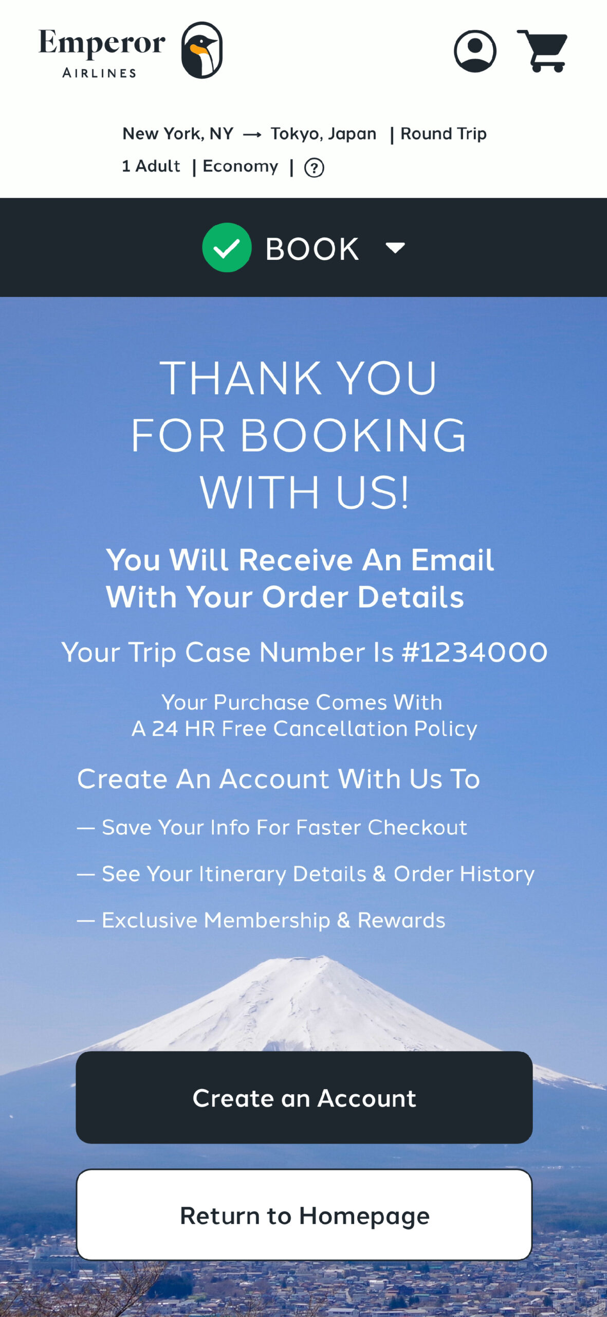
SOLVING INSIGHT 02
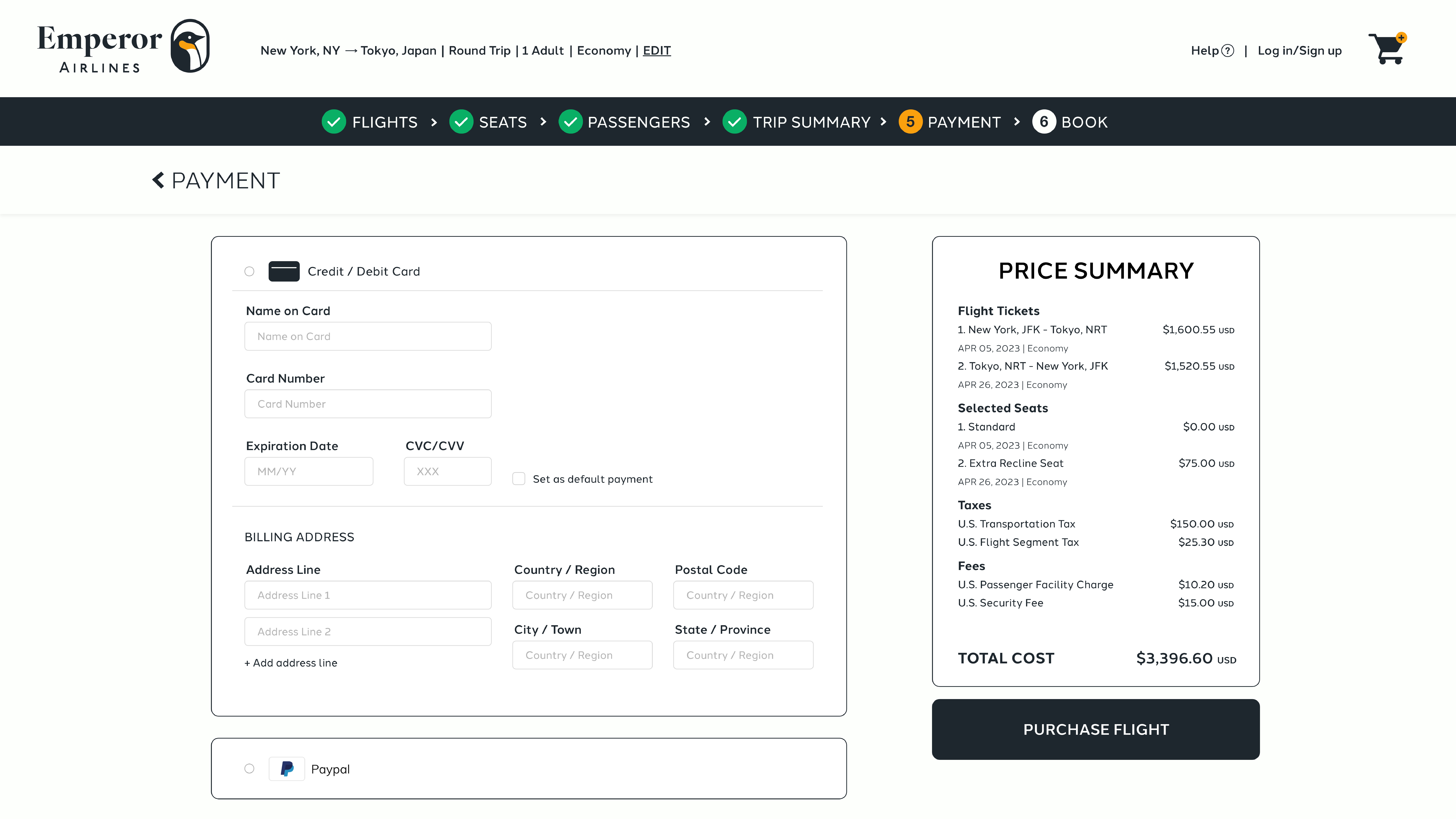
Based on the feedback that the progress bar was difficult to notice, stronger color contrast was added to help resolve that pain point. Each step completed changes to a bright green checkmark, light orange is the step the user is currently at, and white is for the next step.
SOLVING INSIGHT 03
Users were confused about the trending destinations and felt it was too cluttered with imagery. To solve this the layout was simplified to a square grid system. Now users can see all trending destinations at once without the need to scroll.
MAIN USER FLOW
HIGH - FIDELITY PROTOTYPE
All assets were added to create a detailed high-fidelity prototype based on my usability study and insights to reach the goal of creating an engaging, fast, and easy ticket flow for an airline website.
View Emperor Airlines' high-fidelity prototype here.
GOING FORWARD
TAKEAWAYS
IMPACT
Users shared that the final product was easy to navigate, more engaging with the visuals and photography, and demonstrated a strong hierarchy.
WHAT I LEARNED
I learned that it is important to keep designing for a user experience and not just on aesthetics. It is important to design solutions based on user needs.
NEXT STEPS
MORE USER TESTING
Conduct more user studies to find new insights and iterate on designs to create a better user experience.
MEASURING SUCCESS
Once launched, the success of the website can be measured through number of accounts created after booking a flight, online reviews, and gaining repeated users.