INTRODUCTION
Museo de Arte is a art museum dedicated to cultivating art from around the world for everyone to experience. We are exploring new ways to help art museum guests efficiently find and purchase exclusive art-inspired items while exploring exhibitions and increase revenue to continue funding the museum’s goal of collecting, researching, and conservation of the arts.
Target audience are individuals who visit an art museum at least once a year between the ages of 18 - 40.
*Please Note: This is a conceptual project completed as part of the Google UX Design Professional Certificate
Role
UX Designer
UX Researcher
Responsibilities
Competitive Audit
Conducting Interviews
Paper & Digital Wireframing
Low & High-Fidelity Prototyping
Conducting Usability Studies
Accounting for Accessability
Visual Brand Identity
Packaging & Product Design
Iterating on Designs
Project Duration
13 Weeks
THE PROBLEM
Museums are often crowded and have inefficient systems for advertising and promoting their catalog of items. Most museums don’t offer a dedicated app with a focused shopping section to reach shoppers inside and outside of the museum campus. Therefore, engagement with the museum ends after leaving the proximity.
THE GOAL
Design an app for Museo de Arte that allows users to efficiently find and purchase exclusive art-inspired items from anywhere.
UNDERSTANDING THE USER
USER RESEARCH
I conducted interviews and created empathy maps to understand the users I’m designing for and their needs. A primary user group identified through research are art enthusiast adults who visit museums at least once a year.
Researching this user group also revealed that time was not the only factor limiting users from browsing and shopping at museums but also the lack of having an engaging online shopping experience. Most users express frustrations of not having reviews, a wishlist, limited shipping services, and disengaging photography of products. This prevents users from confidently purchasing items thus decreasing revenue and engagement for the museum.
PAIN POINT
EXPERIENCE
01
Museums are often crowded and have long checkout queues and their online shopping presence has limited features
PAIN POINT
NAVIGATION
02
Museum gift shops can be difficult to navigate and overwhelming. Their online shopping presence is often disorganized and busy
PAIN POINT
ENGAGEMENT
03
Museums don’t efficiently promote their new items to guests. Their online shopping presence doesn’t have an engaging browsing experience
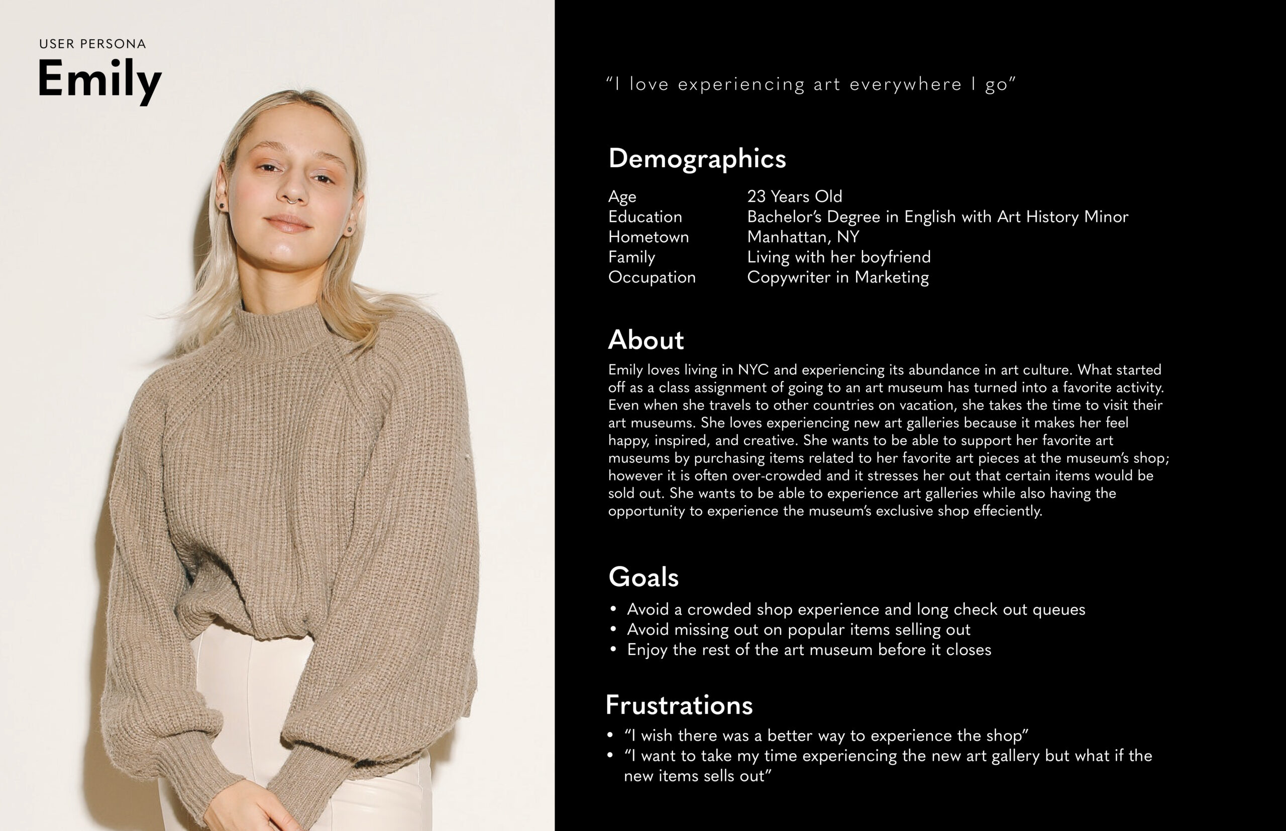
MEET EMILY
Our user persona Emily was created after conducting interviews and gathering insights.
PROBLEM STATEMENT
Emily is an art enthusiast who needs to purchase exclusive art-inspired items of her favorite art piece ahead of time because she wants to avoid crowds and have time to explore an art museum leisurely.
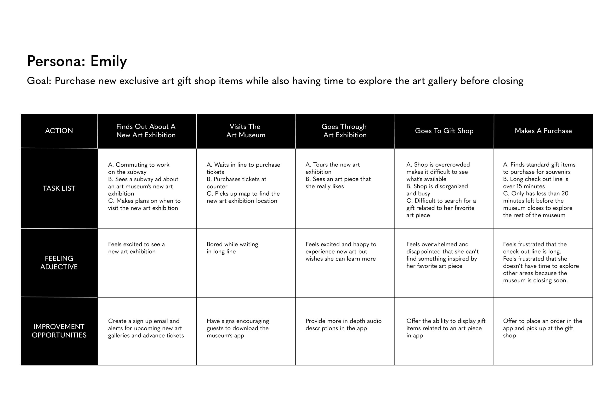
USER JOURNEY MAP
Emily’s user journey map revealed how helpful it would be for users to place an order ahead of time and pick up at the store.
THE PROCESS
COMPETITIVE AUDIT
The competitive audit goal was to identify and compare the e-commerce shopping experience of art museums. The key competitors in my audit are The MET, Museum of Modern Art, and The American Museum of Natural History. The MET and MOMA are the direct competitors while AMNH is the indirect competitor.
GAPS & OPPORTUNITIES
After analyzing the strengths and weaknesses of my competitors I identified key gaps and opportunities.
GAPS
- Lacking or non-existent app
- 2/3 competitors don't offer a pick up in store option
- Limited payment options
- Scan QR codes only unlocks audio tours
OPPORTUNITIES
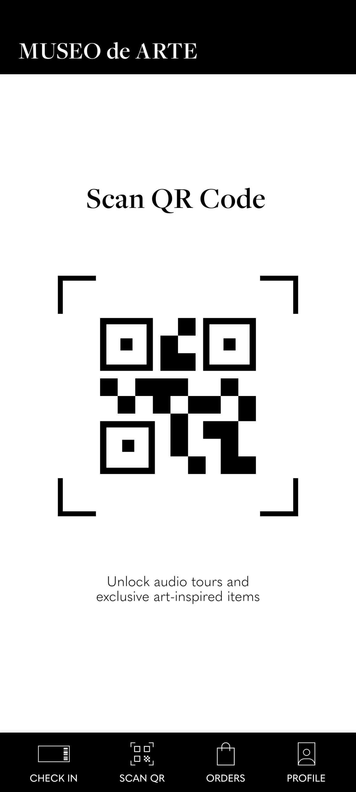
- Elevate the Scan QR Code functionality
- A fully dedicated app that highlights the museum's exhibtions and gift shop
- Offer in-store pickup
- Offer a wide range of payment options
VALUE PROPOSITION
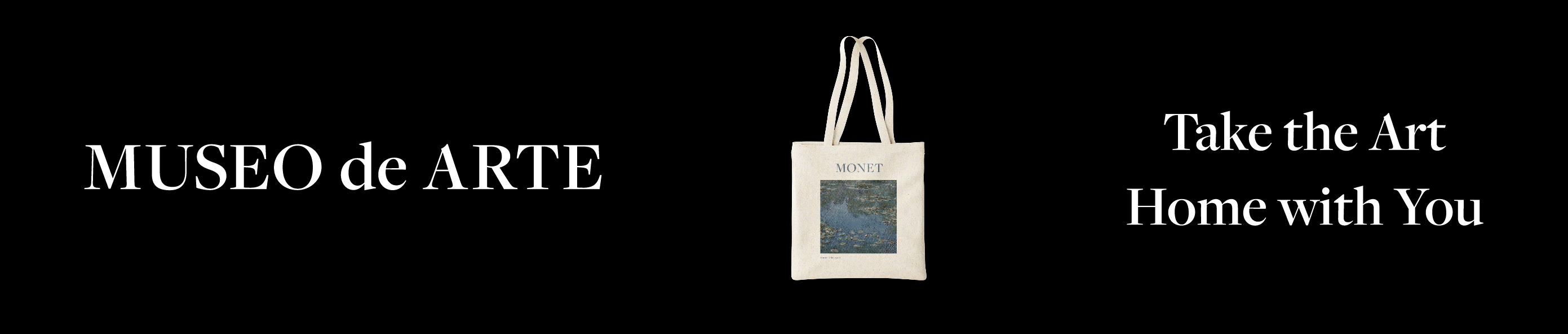
Take The Art Home With You
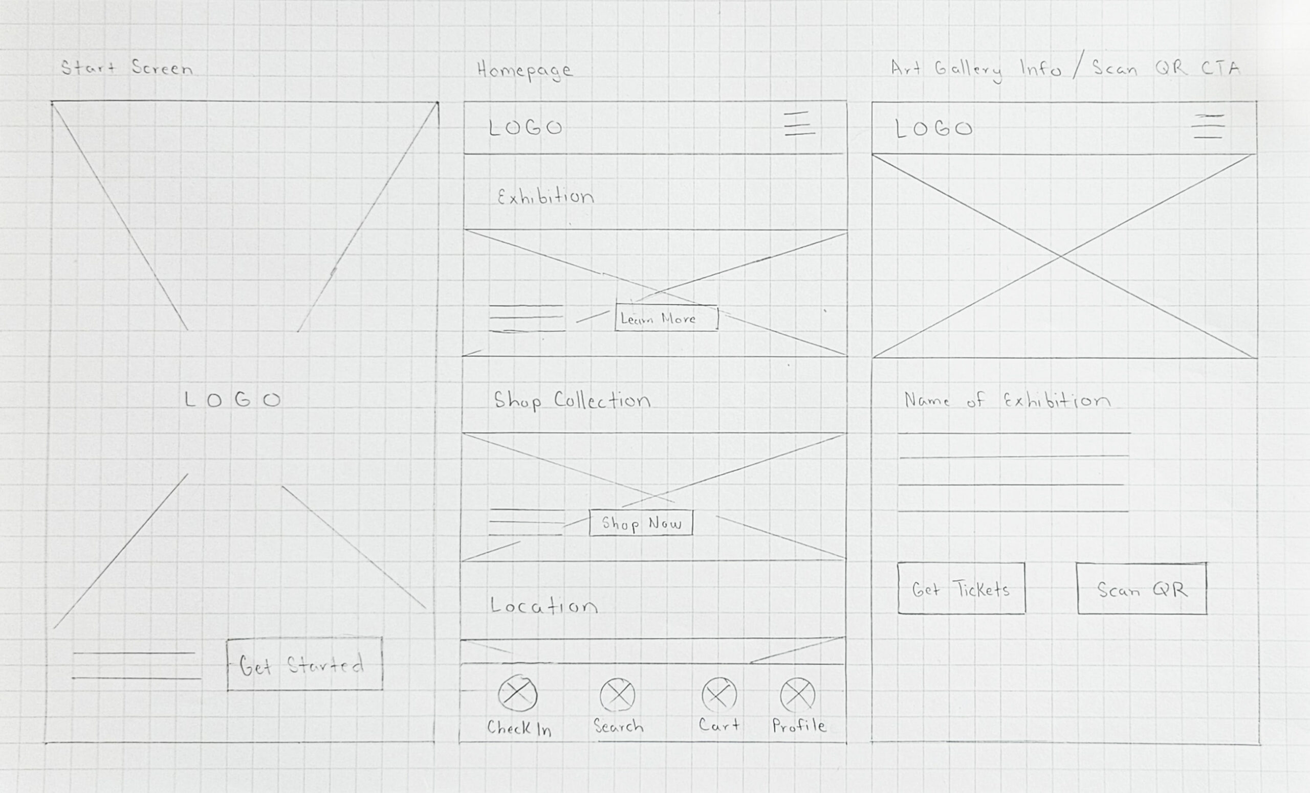
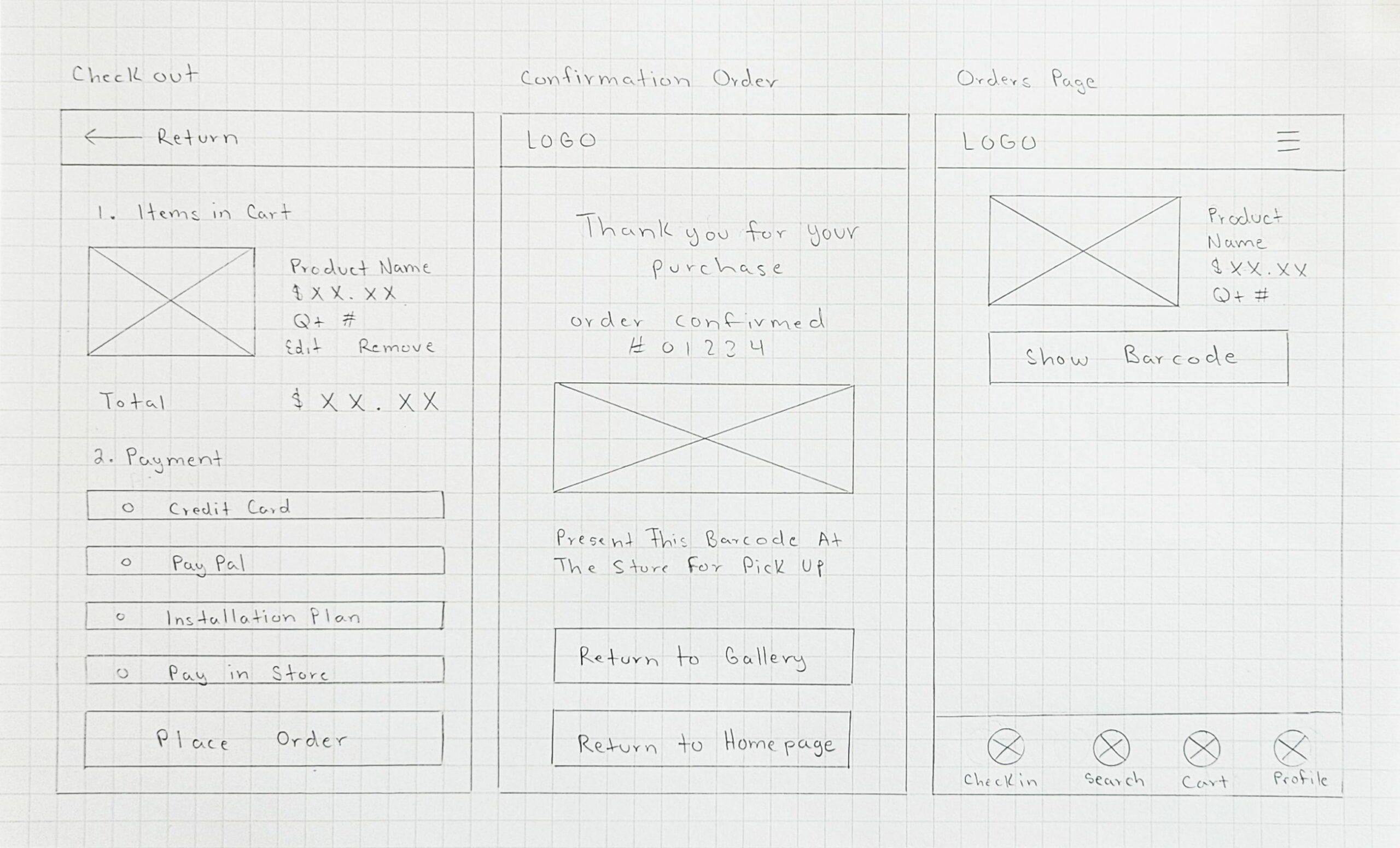
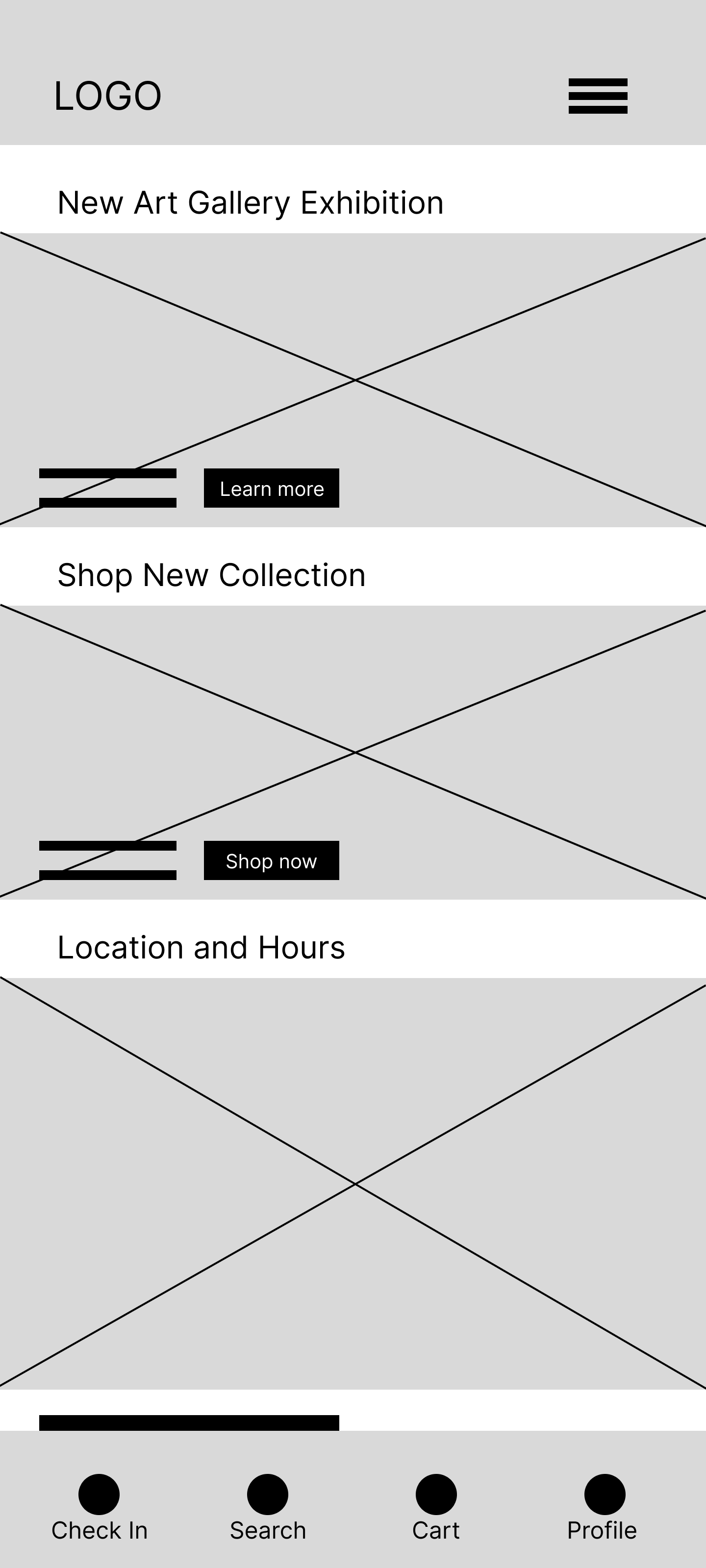
PAPER WIREFRAMES
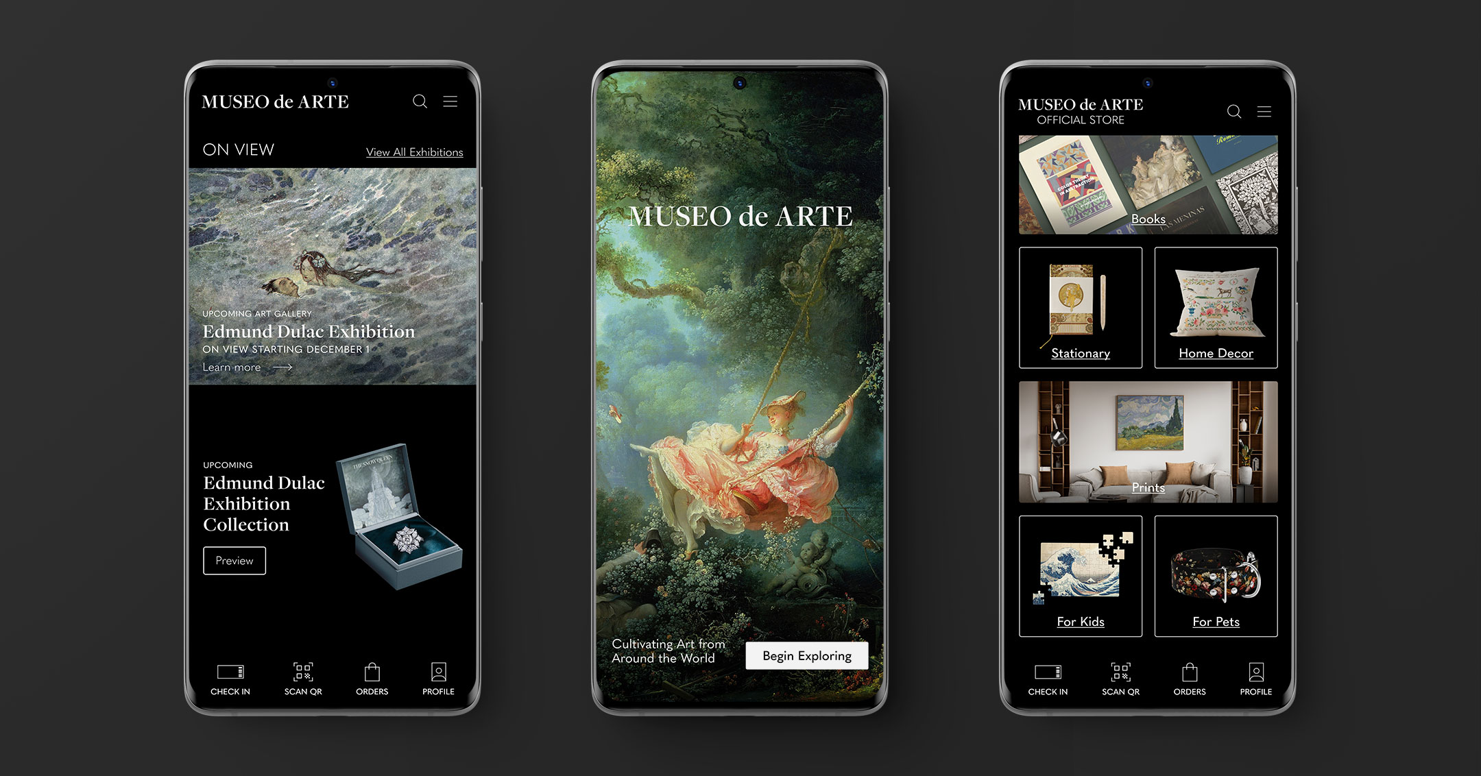
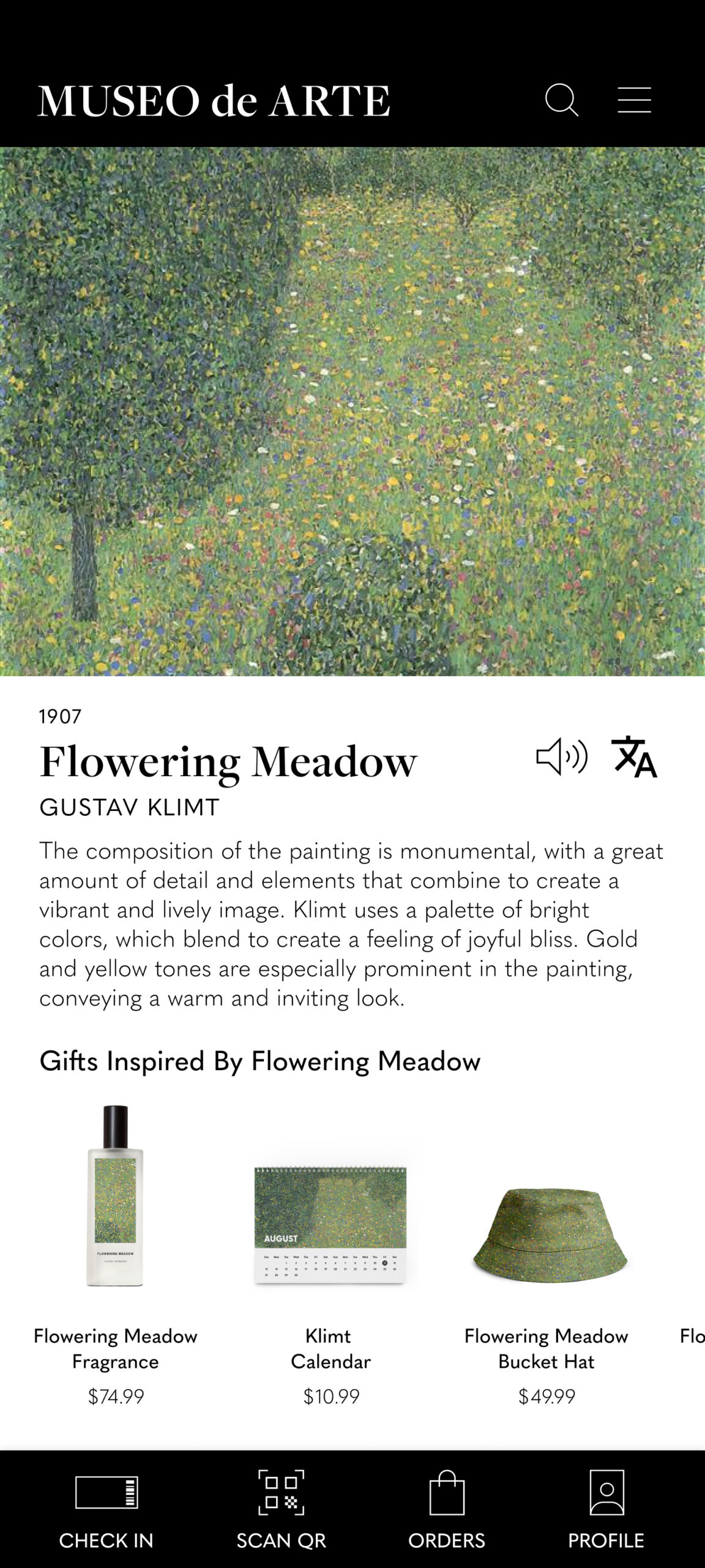
The main user flow is to provide users with an immersive art exhibition experience by using the scanning feature to scan QR codes. This allows users to see available items inspired by an art piece so that they can place an order and pick up at the store.
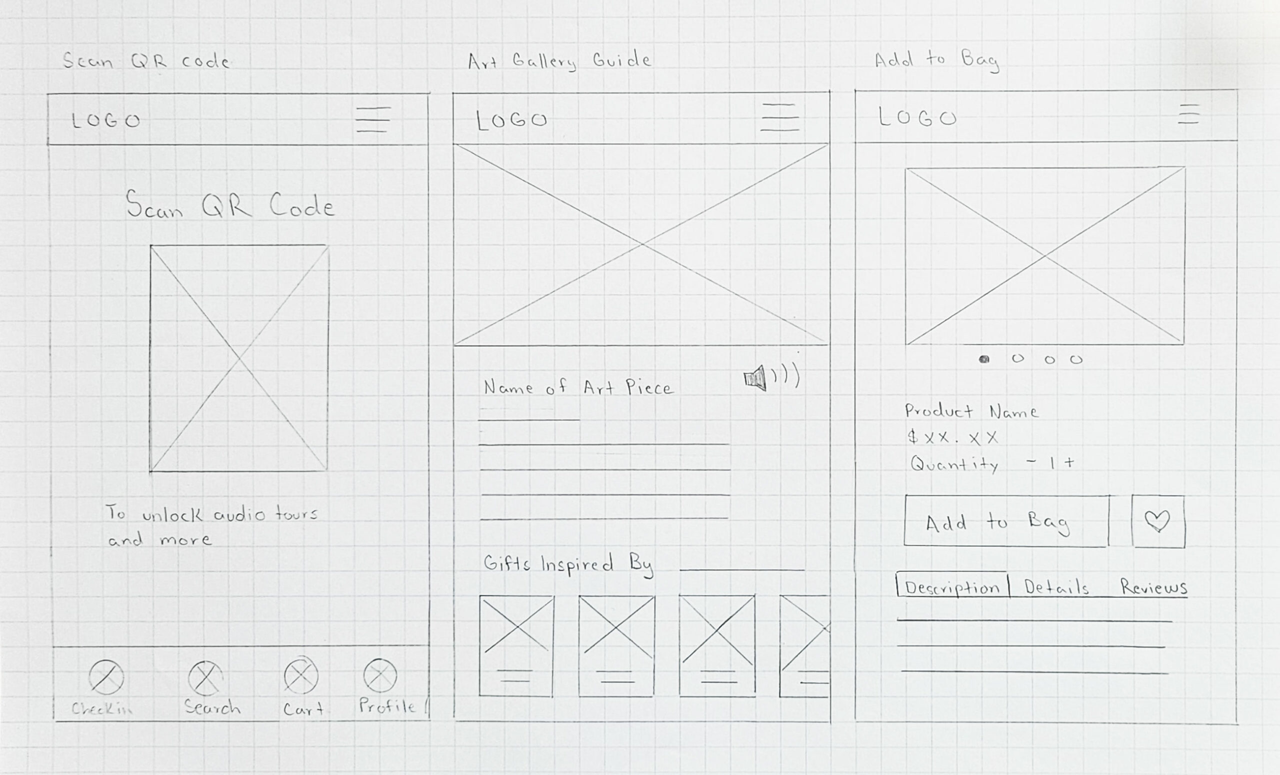
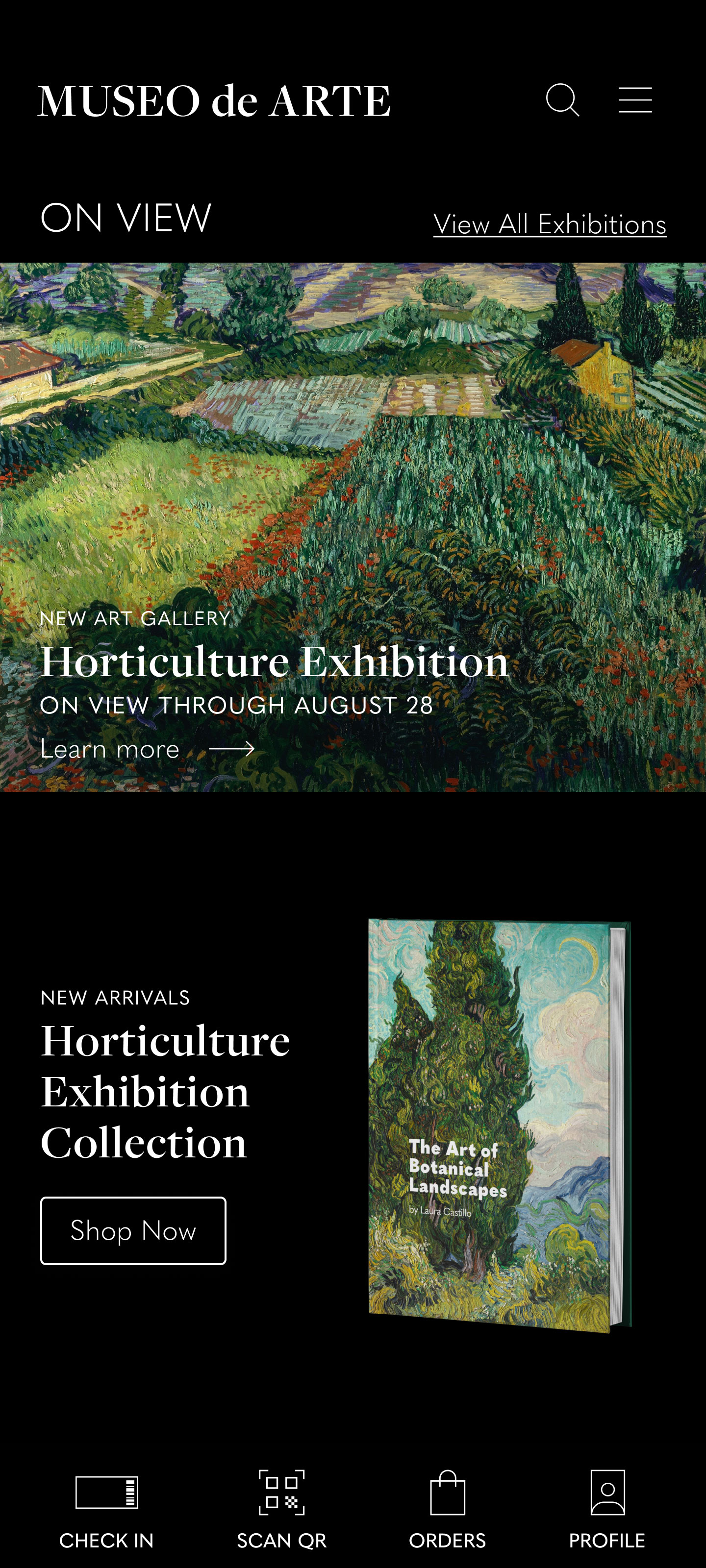
DIGITAL WIREFRAMES
After users have scanned a QR code associated with an art piece they will be welcomed with an audio guide and description along with items inspired by that art piece. This further engages the user to quickly browse through items related specifically to an art piece and encourage them to scan more art pieces that they really like to see related items to purchase.
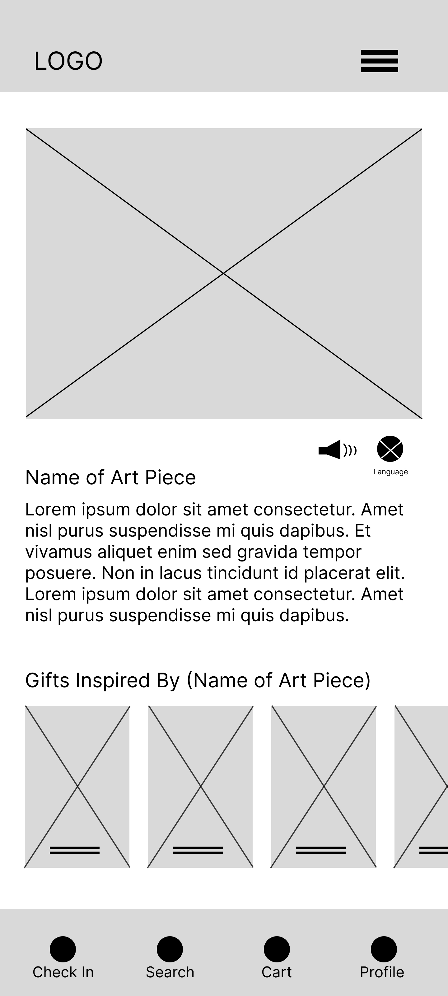
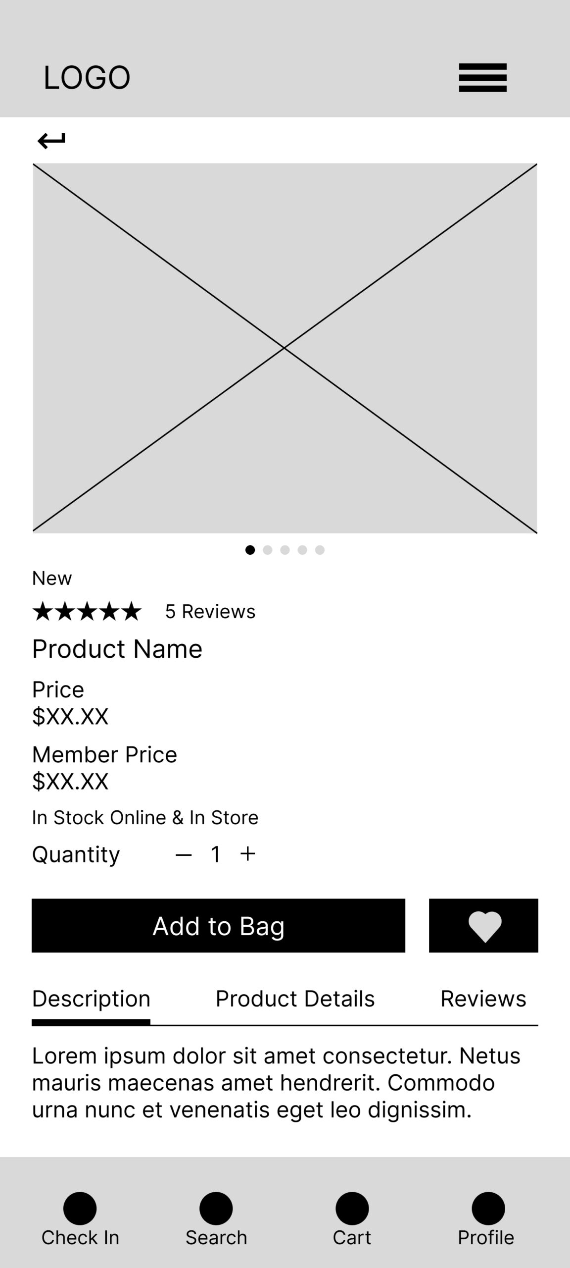
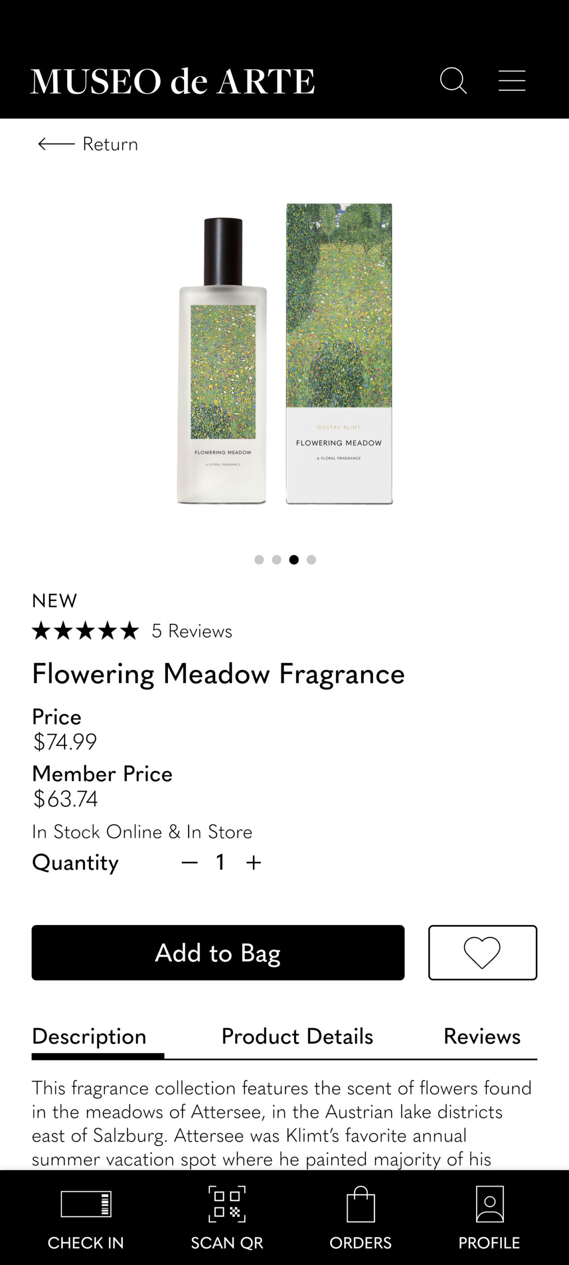
I prioritized displaying informative content such as description, price vs member price, item availability, 5 star ratings, and reviews. The goal is to provide efficient information to make users feel confident and engaged with making a purchase.
- Item availability status for online and in store helps users feel confident that they can purchase items outside of the museum
- Users can quickly navigate between tabs to read about item description, product details, and reviews
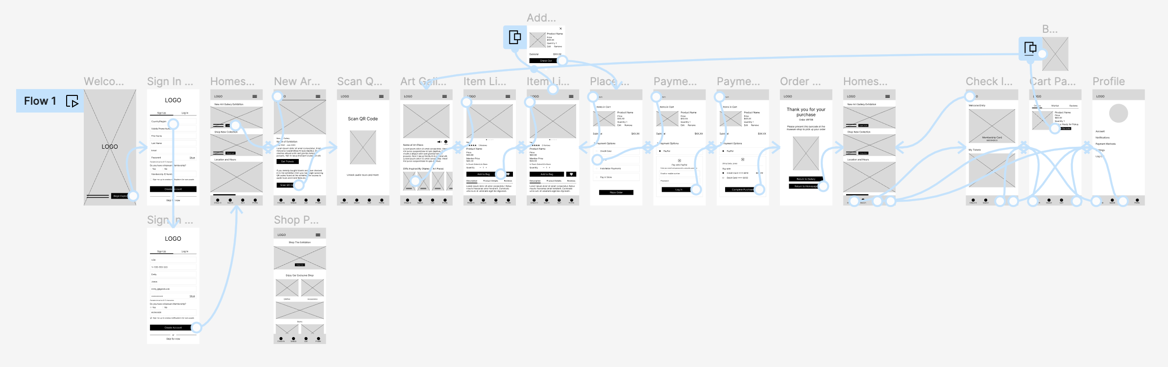
LOW - FIDELITY PROTOTYPE
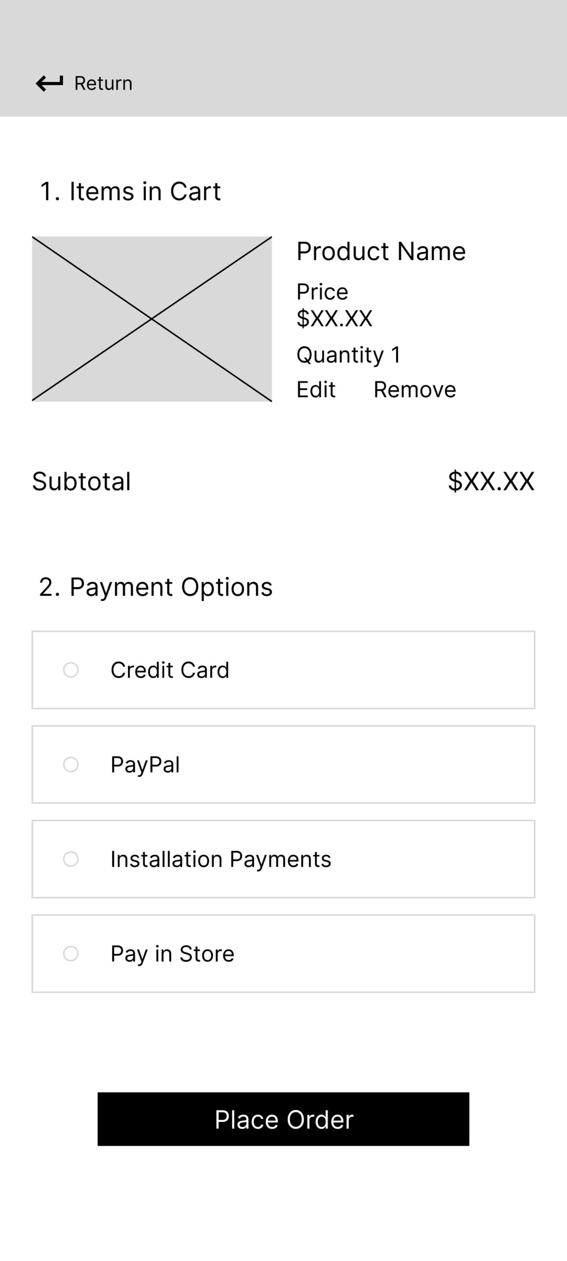
Main user flow for the low fidelity prototype is to scan and purchase art-inspired items in the app and pick up in store.
View Museo de Arte's low-fidelity prototype here.
USER TESTING
USABILITY STUDY: FINDINGS
I conducted a usability study to find out if the main user experience, purchasing and checking out an item, is easy for users to complete. I also would like to understand the specific challenges that users might face in the scanning, navigation and checkout process.
After conducting a usability study I gathered all information to create an affinity map. Next I analyzed and synthesized results to find insights.
INSIGHT
SCAN QR CODE
01
Users felt frustrated that the Scan QR code feature isn’t quickly accessible. Users had to go through clicks before reaching the feature
INSIGHT
BARCODE
02
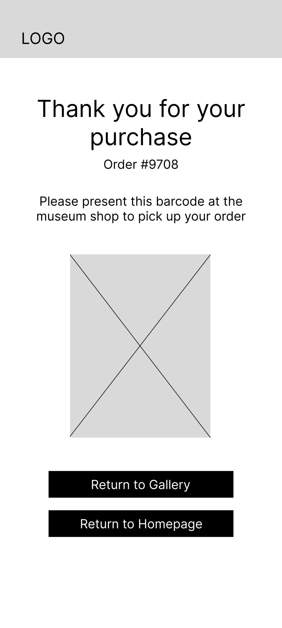
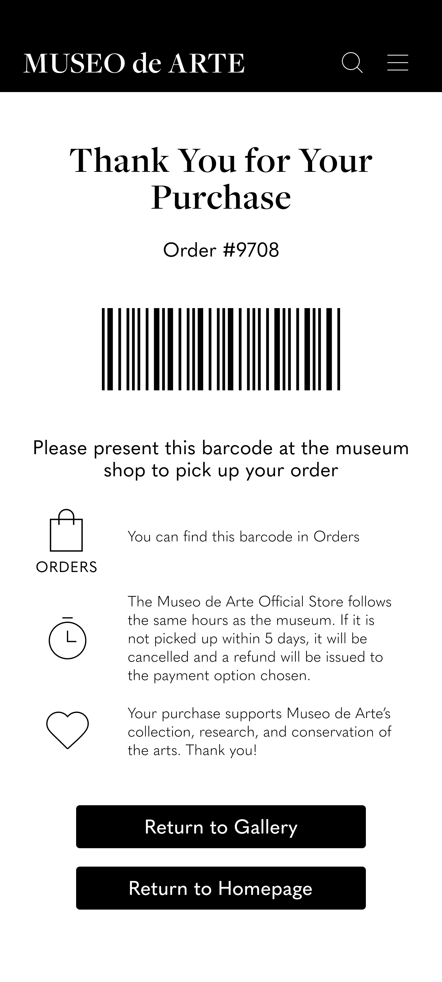
Users felt frustrated they they could not quickly find the barcode they need to present at the store for pick up. Users weren't given clear directions
INSIGHT
CHECKOUT
03
Users were confused about the delivery service when checking out. Users didn't know it was an in-store pick up until the confirmation page
REFINING THE DESIGN
SOLVING INSIGHT 01
To solve the issue of Scan QR accessibility I adjusted the navigation bar to have a Scan QR icon and I moved the Search icon to the top navigation bar.
SOLVING INSIGHT 02
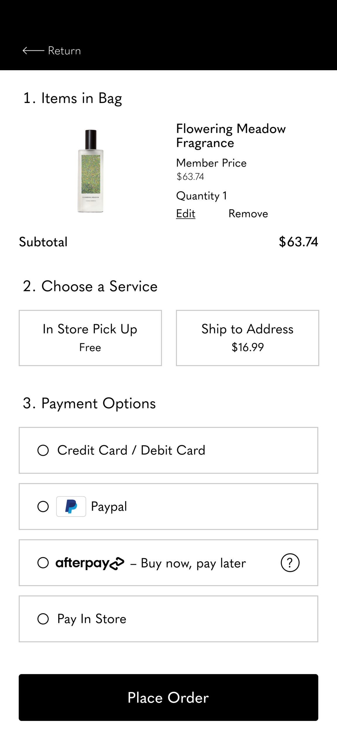
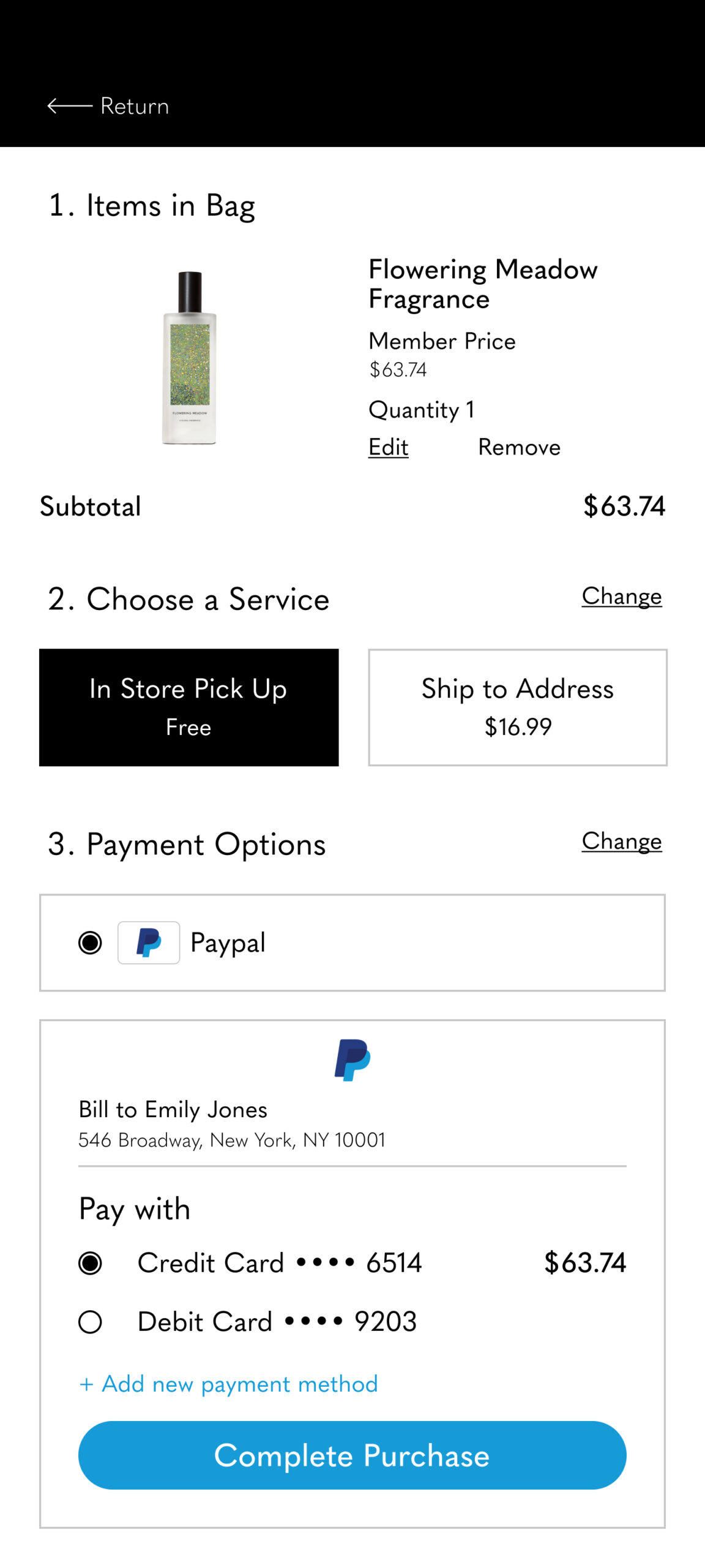
Users were confused at the checkout process. Users didn’t know it was an in store pick up until after confirmation. To fix this user pain point I added a choose a service option between in store pick up and ship to address.
SOLVING INSIGHT 03
Users were left confused and lost on where to find the barcode again to pick up in store. To fix this issue, I added informative descriptions with imagery to further explain the barcode process.
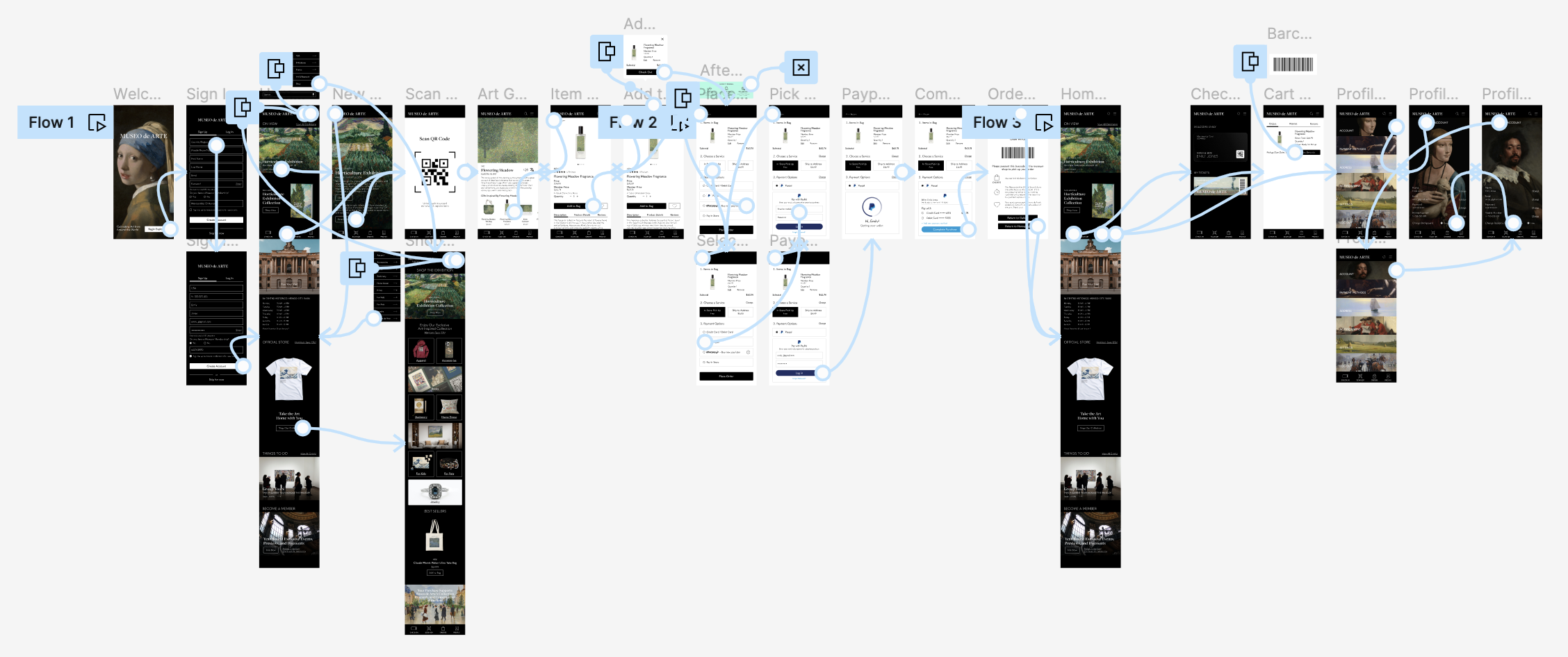
MAIN USER FLOW

HIGH - FIDELITY PROTOTYPE
The final high-fidelity prototype presents an efficient and engaging way to find & purchase art-inspired items, and allows users to pick up in store.
View Museo de Arte's high-fidelity prototype here.
GOING FORWARD
TAKEAWAYS
IMPACT
Users were very impressed and engaged throughout the process. Visual hierarchy and cues were well thought out and well designed. Imagery was very engaging and received positive reactions. Users see themselves using this feature and app.
WHAT I LEARNED
I learned to be aware of biases and to meet user needs by keeping the user in mind at all times. I learned the importance of using strong writing language to convey important information to help guide users along their experiences.
NEXT STEPS
MORE USER TESTING
Conduct more user studies and research to find new areas for improvement or needs.
MEASURING SUCCESS
Once launched, the success of the app can be measured through downloads, app reviews, daily active users, number of in-app orders, and increased revenue.